A Quick Reference on Box-Shadows
Every few months I come across the need to add shadows to frontends, and it seems each time I have to go back and look up how these things work. I always take to the internet for a brush up on box shadows, but I seem to find more information than I’m looking for – I just want a quick cheat sheet, not the War and Peace of box-shadowing. So here’s the cheat sheet I’ll be using from now on to create the shadows I need.
The first thing to note is that for backwards and cross-browser support you’ll need to write your box shadow css three times. Annoying! But its just a matter of writing the same css with different prefixes. Here’s what it will look like:
-moz-box-shadow: 10px 5px 5px #888;
-webkit-box-shadow: 10px 5px 5px #888;
box-shadow: 10px 5px 5px #888;
Here’s the CSS3 specification for box-shadow:
box-shadow: none |  [,  ]
 = inset? && [(2,4)] && color
What? Lets break this down a bit.
First of all, the box-shadow specification tells us that we can have no shadow, one shadow, or a series of comma separated shadows.
Next we come to the shadow specification. First we have ‘inset’. Inset is optional, so unless you specify inset, your shadows will always be offset from the element.
The next part (and this is where you’ll do the bulk of your work) is the length. I always have trouble remembering this part of this definition – I know its a combination of 2-4 numbers, but what do the numbers refer to? Writing it out like this will help me remember it better:
length = horizontal offset, vertical offset, blur radius(optional), spread distance(optional)
or maybe:
length = HVBS
Someone more clever than me could come up with a little mnemonic device for this. Like, “Happy Valentine’s, Big Sister” or “How Very Brilliant, Sartre”… I’ll keep working on that bit.
The first two numbers are the required parameters, horizontal offset and vertical offset. Like it says in the names, these parameters define how far your shadow is offset from the original element. For horizontal offset, a positive number moves the shadow to the right, a negative number moves it to the left. For vertical offset, a positive number offsets the shadow below your element, and a positive number offsets it above.
Here’s how you would create a shadow that is more horizontal than vertical:
#horizontal {
-moz-box-shadow: 10px 5px 5px 5px #888;
-webkit-box-shadow: 10px 5px 5px 5px #888;
box-shadow: 10px 5px 5px 5px #888;
}
And here’s a shadow thats more vertical than horizontal:
#vertical {
-moz-box-shadow: 5px 10px 5px 5px #888;
-webkit-box-shadow: 5px 10px 5px 5px #888;
box-shadow: 5px 10px 5px 5px #888;
}
The blur radius is optional but to me this is the most important part of the shadow – its what makes your shadow look ‘shadowy’ and not just like an offset box. The higher the blur radius, the more blurred your shadow will be.
Here’s an example of a shadow with and without a blur radius:
#blur {
-moz-box-shadow: 10px 5px 5px 0px #888;
-webkit-box-shadow: 10px 5px 0px 5px #888;
box-shadow: 10px 5px 5px 0px #888;
}
#no-blur {
-moz-box-shadow: 10px 5px 0px 0px #888;
-webkit-box-shadow: 10px 5px 0px 0px #888;
box-shadow: 10px 5px 0px 0px #888;
}
The spread distance is another optional parameter. Spread distance refers to the size of the shadow itself. A shadow with no spread distance will be the same size as the original element, a shadow with a positive spread distance will be larger, and a shadow with a negative spread will be smaller than the original element. To demonstrate this, here’s a shadow without offset, but with spread distance:
#spread {
-moz-box-shadow: 0px 0px 5px 10px #888;
-webkit-box-shadow: 0px 0px 5px 10px #888;
box-shadow: 0px 0px 5px 10px #888;
}
#no-spread {
-moz-box-shadow: 0px 0px 5px 0px #888;
-webkit-box-shadow: 0px 0px 5px 0px #888;
box-shadow: 0px 0px 5px 0px #888;
}
The final part of the shadow specification is for the color. Since this is a cheat sheet about shadows, I’m going to presume you already know how to specify a color.
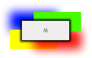
The specification allows you to combine shadows to create different effects. One of the things that it took me a while to figure out is how to add a shadow on only three sides of a element. Here’s where adding multiple shadows to an element comes into play – in order to add shadow to three sides, we actually add three separate shadows, one for each side.
Below I’ve broken down exactly how each side is constructed, as well as the final product. Here you can also see I’ve added a negative spread distance to the shadow, so that its a little bit smaller than the element its shadowing.
#shadow-bottom {
-moz-box-shadow: 0px 7px 5px -5px blue;
-webkit-box-shadow: 0px 7px 5px -5px blue;
box-shadow: 0px 7px 5px -5px blue;
}
#shadow-right {
-moz-box-shadow: 7px 0px 5px -5px red;
-webkit-box-shadow: 7px 0px 5px -5px red;
box-shadow: 7px 0px 5px -5px red;
}
#shadow-left {
-moz-box-shadow: -7px 0px 5px -5px green;
-webkit-box-shadow: -7px 0px 5px -5px green;
box-shadow: -7px 0px 5px -5px green;
}
#shadow-three-sides {
-moz-box-shadow: 0px 7px 5px -2px blue, 7px 0px 5px -2px red, -7px 0px 5px -2px green;
-webkit-box-shadow: 0px 7px 5px -2px blue, 7px 0px 5px -2px red, -7px 0px 5px -2px green;
box-shadow: 0px 7px 5px -2px blue, 7px 0px 5px -2px red, -7px 0px 5px -2px green;
}
I hope other developers find this guide useful – give me a few months to forget and I’m sure I’ll be referring back to it myself!
For more information about box-shadows I recommend:
1 Comment