CSS3 Media Queries: Making Your Site Mobile-Friendly, Now With 50% Fewer Excuses!
If you’re like me, you probably do an increasing amount of your personal business on your mobile device, such as paying bills and conducting transactions with your banking accounts. And why not? It’s been five years now since the first iPhone came out, and since then mobile Internet use has become a part of everyday life. What’s more, major institutions such as Wells Fargo, Citibank and AT&T have their own mobile apps. So taking care of your financial business on your smartphone should be a complete breeze, right?
Wrong!
As it turns out, not everyone has gotten with the program. I do business with three different institutions that still don’t have mobile-friendly sites. One of them can arguably be excused since it’s a local credit union, not a major bank, so it can be expected to be a little on the low-tech side. But the others?
One is the asset management division of Deutsche Bank, one of the largest financial institutions in the world.


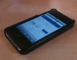
And the other is Barclaycard, issued by Barclays Bank, one of the UK’s oldest banks.


As you can see, conducting financial transactions online with this kind of screen view is rather, er, challenging. But on the bright side, you get to pretend you’re Sherlock Holmes, sifting through data with his magnifying glass.

Well, as much of a surprise as it may be to some who know me, I’m too old to play make-believe. And when you’re doing grown-up business, having to navigate a desktop-sized site on a mobile-sized screen is quite a tedious experience.
Okay, so these banks aren’t willing to shell out the big bucks for an iOS app developer. But how about making your web site more mobile-readable?
It’s become even easier recently, with the introduction of CSS3 media queries that detect the current width of a desktop browser canvas or the maximum width of the device you’re using. If your site uses these queries in its style sheets, it will be able to switch to different sets of styles depending on what browser size or device is viewing the site.
The basic syntax is: “@media only screen and,” followed by a set of parentheses containing the media query, which contains the viewing specs you want to define for the custom styles.
@media only screen and (max-width: 639px) {
   // custom styles for site on a screen less than 640px wide
   #wrapper { width: 640px; }
   p { font-size: 11px; }
}
You can combine multiple media queries in one line:
@media only screen and (min-width: 640px) and (max-width: 1024px) {
   // custom styles for a screen between 640px and 1024px wide
   #wrapper { width: 100%; }
   p { font-size: 13px; }
}
The media queries we’ve just seen are for styles that will apply to the site viewed through a certain browser size, regardless of the device. But you can also create CSS3 media queries that apply not just to certain browser sizes but specific devices.
@media only screen and (device-width: 768px) {
   // we use this for iPad-specific styles
   #menu_default { display:none; }
   #menu_ipad { display:block; }
}
@media screen and (max-device-width: 480px) {
// we use this for iPhone-specific styles
#menu_default { display:none; }
#menu_iphone { display:block; }
}Grio makes extensive use of CSS3 media queries to make its own site presentable at any browser width and across all media devices. Here’s what Grio.com looks like in different browser widths and on the iPhone:


So, having a mobile-friendly presence is even easier and faster than before, and as mobile use becomes more commonplace, it’s becoming even more imperative. If you can afford to pay for a professional-looking site, you can probably afford the extra few hours to have the developers make it viewable on an iPhone or Android. And your users will thank you for it.
1 Comment