Centaurs Versus the Total Perspective Vortex: Data Visualization and Complexity
Data visualization projects are probably what first drew me to software. I loved the idea of creating tools with beautiful interfaces that allowed people to see, interact, and play with big systems and concepts that are ordinarily hidden from view. Our lives are shaped and shaken by complex forces; making them tangible is a potent challenge, and one that really speaks to me.
In this post, I’d like to talk about some of the ways data visualization holds utility as a means of democratizing systems thinking, some considerations for how this can be effectively achieved, and how we might think of data visualization as a tool in our kit when approaching Big Serious Complex Problems.
Working in the realm of the visual carries an immediacy that textual data does not. It has great potential for information density and clarity. It is increasingly vital: More data is being generated and made available than any other time in history. But how might we make sense of it? Let’s consider first how cognitive load works: How much mental effort is used in working memory (or “How much can you even at any given time.”)
Cognitive load theory was first described in 1956 by Geroge Miller. As a basic tenant, no one can keep track of much more than 7 things in their mind at any one time, plus or minus two:
●●●●●●●±●●
Thus, the 7-digit length of phone numbers before area codes, and the chunking of longer numbers like SSNs or credit cards into segments of 2,3, or 4 digits.
Cognitive load is what you’re up against as a design constraint any time you design for a person looking at new information or learning something new, and that’s not a lot of RAM. What are the types of cognitive load, and how can an understanding of cognitive load allow us to communicate more clearly?
 Intrinsic Cognitive Load
This is the immutable part of any problem. It’s how much effort, more or less, it takes to take in and understand something new. To promote learning it needs to be managed, by sequencing and segmentation.
 Extraneous Cognitive Load
If there’s any elaboration on the what’s necessary to the intrinsic load, it falls under this category. It’s noise and clutter, and needs to be minimized so it doesn’t distract from learning. Those two are easy enough to understand, but for our purposes, the third type of cognitive load is most interesting:
 Germane Cognitive Load
This is the work that needs to be maximized – the germane cognitive load works to build prosthetic knowledge. Once people have access to abstractions and schemas for handling complexity, they can use them to handle more input without getting overloaded.
Schematization, automation, and modularization are the tasks that the germane cognitive load uses to build a more permanent foundation of understanding.
Let’s say a bit more about schemas:
Schemas are how we can use abstractions to represent complexity, and how we can group sets of things into ONE BIG THING that can then be considered part of our set of seven. Schemas assist in preventing cognitive overload. Any schema will always be somewhat inadequate, necessarily opinionated about what is important, and good schemas will adapt and change over time as necessary. Think of schemas like DRYing out your code, but for everything.
Avoid helmet fire: Use a schema.
Working in the realm of the visual allows us to leverage what we know about cognitive load to communicate with efficacy, but working within the realm of the visual requires care: As humans we’re more susceptible to manipulation by visuals.
It’s been shown that pairing textual information with images increases the “truthiness” of images. Here’s an arbitrary example:
I bring this up because impact is different than integrity, and when trying to work in the realm of data visualization, which purports to allow us to see patterns in clean, plain, straightforward terms, one needs to temper their impulse to create something that’s sensational propaganda. Data visualization is served best by following the same guidelines as something like scientific illustration (which is, I might add, also a type of data visualization):

From John Audubon’s Birds of America
- Scientific illustration is specific enough to provide the identifying features of the category of thing it illustrates, without getting lost in the individual details.
- Information is more often than not embedded, which minimized split attention and gives context integrated with the subject matter.
- Enough information is included that a story can be told with what’s available. They viewer is left with a sense of the system the subject exists within, and can build their own sense of recognition from there.
- Beauty and clarity – successful scientific illustrations require a sense of composition and design that give the viewer a sense of enjoyment along with information.
$Predators at the door
We’re no longer fighting wolves or hunting mammoths, even if sometimes that’s the threat model our minds operate within. In fact, we now know enough ecologically to be able to understand the harmful consequences of eliminating keystone predators or over hunting large game. We’re in a significantly more complex time, and understanding what the actual threats to our well being are in an age that is post the Industrial Revolution, The Automobile, Nuclear Power, Global Trade and the Internet mandates a deeper dive.
Most of the problems we face are at least as complicated as this chart from 2005, which was used in a powerpoint presentation to explain the ground situation in Afghanistan:
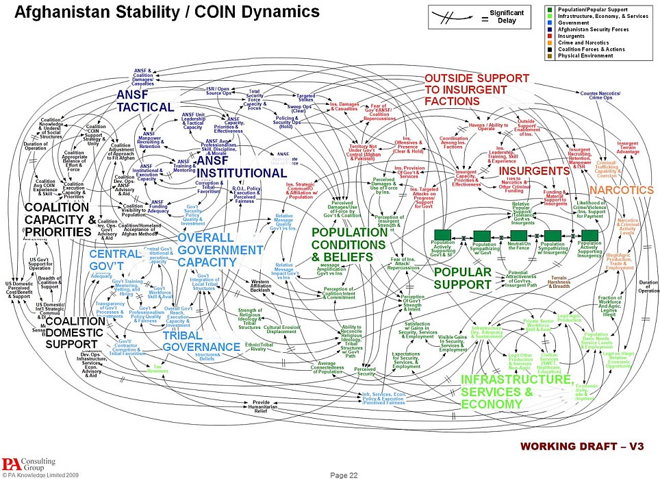
‘When we understand that slide, we’ll have won the war,’ General Stanley McChrystal said, regarding the above document. This chart is bad not because it is inaccurate, but because it confounds and overwhelms. It’s not a useful map, it’s a Total Perspective Vortex.
Here are some don’ts that are really obviously laughable don’ts, mostly for the lulz.
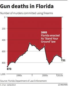
Don’t layer comparative analysis over geospatial representations:
If you’re attempting something that requires comparative analysis, don’t make it a radial chart, and please for decency’s sake don’t superimpose charts it makes things more confusing:
Don’t blatantly mislead people:
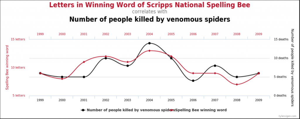
Avoid spurious correlations:
Here’s some good stuff as a palate cleanser:
Shipmap.org – A visualization that maps global shipping traffic
Poppy Field – explores death tolls from wars around the world in the last century
Crime in Context – explores trends in criminal activity in the United States since 1975
The 2013 NYT visualization of Obama’s proposed budget
xkcd’s Earth Temperature Timeline
Here’s what the good stuff approximates:

This is Earthrise. Taken in 1968, during the Apollo 8 mission, it’s one of the most influential environmental photographs in history. Here you see our little planet hanging in a black void, the balance we hang in, and the finiteness of it all. Related, is something called the overview effect: a cognitive shift in awareness reported by some astronauts and cosmonauts during spaceflight, often while viewing the Earth from orbit or from the lunar surface. It’s the holiest “I can see my house from here” sort of feeling.
When you see really solid data visualizations, with beautiful design and integrity, it has a similar effect.
As workers in tech we have to ask ourselves, what are we optimizing for?


Let’s optimize towards CENTAURS, and let’s abandon BUTLERS.
What I mean by that, is creating technology that serves to help give agency to the people we build products for. When you abstract away too much information, people might find things easier in the short term, but in the long term they forget how to do the work they previously did. Butler tech does it for you, but when the butler goes away you might not be able to find your way home without your phone, or be able to cook for yourself, or read a landscape for edible plants, or etc. For example, here’s a link to an interview with Christian Madsbjerg that discussed AI, deep learning, and skin cancer that features discussion of the dilemmas imposed by butler technology.
In the long run, we flourish better as a society if what we make gives people a greater sense of agency, and the ability to make smarter choices. Centaur technology acts as an enhancing prosthetic. It assists you in making choices, and when it goes away you function better than you did before you had it, like a robot suit that also makes you stronger when you aren’t wearing it and how cool is that? 🤖
It might seem hyperbolic to say that so much could hang on whether or not your data visualization is well designed, but if you’re building something that’s to be widely used, widely distributed and have big impact, that should be the scope of your consideration, and that level of integrity is entirely warranted. These are the stakes: With great scale comes great responsibility.