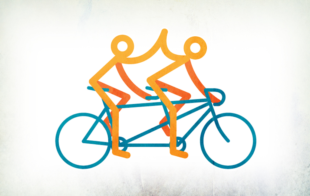
Design & Development in Tandem
I had the privilege of attending this year’s San Francisco Smashing Conference in early April where I listened to presentations from founders, designers, and front-end developers.
Smashing Magazine is a fantastic online resource for professional designers and developers. They also publish their own books and e-books, as well as host conferences in the U.S. and Europe.
As a designer at Grio, I regularly partner with developers and other roles to design, develop, and iterate on products together. While the Smashing Conference was a great experience of soaking in knowledge related anywhere from web performance to living design systems and atomic design to editing images in CSS, it was special in that it gave me new perspectives on how to better the partnerships I have in teams, which in turn betters the products I’m working on.
One key part of the conference was the workshop I took, led by Dan Mall, an award-winning designer and founder of SuperFriendly, a design collaborative. During our workshop we looked at product design and the responsive work flow. I’d like to touch on one approach in the workshop that opened my eyes to a new way of design thinking and doing: Design and Development in Tandem.
With our objective of redesigning the Smashing Conference homepage, we split up into small groups that contained at least one designer and one developer. With the assumption that we’d already conducted user research, Dan led us through 3 other methods to preface our working in tandem:
- Divergent & Convergent Thinking: brainstorming methodology introduced in Change by Design by Tim Brown, that works by generating as many ideas as possible and then converging those ideas to a best solution. This exercise helped us to establish our product goals and principles.
- Only-ness Statement: establish the product uniqueness.
- Objectives and Key Results: method invented at Intel and made popular by John Doerr; a means to define and track objectives for the project and their outcomes.
With these under our belts, we were ready to dive into our design and development in tandem.
STEP 1: SKETCH
First rule: anyone can sketch. All you need is paper and pen. By sketching, each team member will work to establish content hierarchy and information architecture. But HOW? First go back to your Product Goals (established in method A) to determine the content hierarchy.
- Take your paper and fold it length-wise (hotdog). This represents your mobile device’s screen width. Crease the paper in half (skinny hamburger). This crease represents your fold-line. Anything drawn above it is considered “above the fold” and anything below is content “below the fold”.

How to prepare your paper for sketching.
- Draw full-width boxes on your paper that are proportional to the priority set for each of your top goals. The location of each box will tell the priority (top priority goes first at the top of the screen). The height of each box represents a balance of priority and how much room you realistically may need for the content that will go inside of it.
We decided to narrow our focus to 3 for the homepage redesign. Our goals were the following in order of priority:- What the conference is about
- Who are the speakers
- Dates/times/schedule of conference
- You’ll then number (1-3) and title each box with the goal it’s trying to reach.

Completed sketch wireframe.
Now that you have your content hierarchy established, you’ll focus on the information architecture and UI patterns. Go back to the Key Results you’re trying to achieve for the project (established in method C) and ask yourself: How can I design these pieces of information to achieve our Key Results? What patterns, layout, elements, etc.?
For example, one of your Key Results was “25% faster initial page load (goal: from 8s to 6s)”. So you’ll be weighing that with the product goals and the content you need to inject. You wouldn’t want to design something that will slow the homepage down significantly, while still being able to represent the necessary content in a way that helps your users find the information and complete the tasks.
Do this roughly for each of your 3 boxes/product goals.
You’ll then review each sketched wireframe as a team and determine a direction for the team, whether that’s combining ideas or just choosing the best one. This is your wireframe; a starting point for your whole team with an idea of the content hierarchy and information architecture.
STEP 2: SET UP
With your wireframe completed, now time for each team member to get set up in your own environments. The designer will go into Photoshop, Sketch or whatever program s/he feels comfortable in. The developer will set up her/his environment. Other members (Product Manager, Content Writer, etc.) can start creating a project plan, set up the team’s task manager, or start writing content.
The designer is setting up, for what Dan Mall calls, an Element Collage. This is a canvas with several elements on the page that together look like a collage. Each element is served to represent the content you planned in your first step of Sketching. To create the Element Collage, consider the following:
- Start by creating a 2000 x 2000px canvas.
- Each element can’t be larger than 320px wide. This is the most aggressive constraint we’ll be working with while designing responsively.
The developer will need to do the usual set up, thinking about what you’re building and what framework will work to support that. If you have multiple developers, delegate tasks (e.g. front-end vs. back-end).
STEP 3: TANDEMIZE
So what’s the process and what are the rules?
- Each team member will work in parallel at the same amount of fidelity.
- Be flexible to multiple approaches.
- Do what the developer needs.
- Who makes the decisions? The developer.
You’ll each begin roughly drafting content that reflect the solutions in your sketched wireframe (established in STEP 1: SKETCH). The link between each individual team member is the product goals and principles, the objectives and key results you established, and the user research findings.
The designer will begin creating single elements in her/his Element Collage. This can be grey boxes with text to reflect the wireframe direction.

Element Collage: start with low fidelity elements no larger than 320px wide.
The content writer is writing content to inject in the designer’s Element Collage.
The developer is coding elements that implement what’s in the designer’s Element Collage. S/he is also making decisions about feasibility and problem solving along the way.
Each individual is contributing her/his own ideas and feeding off one another; there’s a constant synergy occurring.
If the product manager has a concept of how to formulate the content, the designer will work that into the Element Collage, lay it out, style it, and the developer will peek over and work that into the code.

Element Collage: fidelity is getting higher with content injected by content writer.
If the developer feels there’s a quicker more efficient and user-friendly solution to presenting a piece of content, the designer will then work that into the design solution. Each person must be flexible to try others’ ideas.

Element Collage: fidelity is getting higher and design of homepage impacted by developer input.
Finally, the developer’s progress:

Homepage coded by developer.
Final point is that the developer should be the decision maker. I have to admit, this was shocking news to me; however the logic makes sense. As Dan explains, the job of building the website/app is the developer’s, so let’s “turn the ship around” (said by David Marquet in Turn the Ship Around!) and move authority to where the knowledge is or where the work is being done. Of course, it should go without saying that everyone in the team should be making decisions based on the product goals and principles, key results, and user research. But if the developer wants to be given specs, we should work to provide them to her/him. If the developer wants to create the specs, s/he should feel empowered to do so.
While I can see some challenges in scaling this exact approach for large projects, the frame of mind and principle of multiple roles working in parallel can produce great results both in the empowerment of your team members, as well as in the product and its iterative, thought-through design.
Next time you’re working on a team, I encourage you to work alongside your team members, keeping an open mind, open communication, and flexibility to create the best product together. I hope this approach can help you when doing so.