Dieter Rams’s Ten Commandments

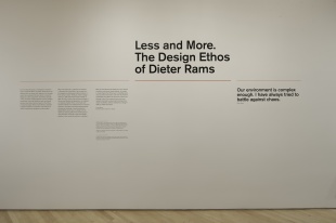
You might not be aware of it yet, however SFMOMA (the San Francisco Museum Of Modern Art) is currently hosting Dieter Rams’s “Less but Better” product exhibit.
You might also not be aware of who Dieter Rams is, since he is not directly related to the software industry.
Indeed, for almost 40 years Dieter Rams was Chief of Design at Braun’s: he designed record players, razors, radio sets, etc.
He didn’t have much to do with computers.
So why talk about him?
Well, he is one of the most prominent design engineers of our era. His designs have affected many fields, as well as influenced and inspired many designers. This includes Apple’s Vice-President of Industrial Design: Briton Jonathan Ive.
A few seconds looking at the designs and the similitudes are striking:
| |
|
| iPhone Calculator App. |
ET 66 calculator, 1987, by Dietrich Lubs for Braun |
Dieter Rams work is remarkable in that he was not just an innovator; he was also an aggregator and a simplifier, putting words to ideas. He strived to do better with less.
“Surfaces that were without apology, bold, pure, perfectly proportioned, coherent and effortless” – Jonathan Ive.
Over the years, Rams was able to refine, and then define his design ideals. They are summed up in his Ten Principles for good design (also referred to as his Ten Commandments):
- Good design is Innovative.
- Good design makes a product useful.
- Good design is aesthetic.
- Good design makes a product understandable.
- Good design is unobtrusive.
- Good design is honest.
- Good design is long lasting.
- Good design is thorough, down to the last detail.
- Good design is environmental friendly.
- Good design is as little design as possible.
Ten principles that follow themselves.
I could dig in to each principle, however that is not the object of this blog article… Those principles are quite self-explanatory, since most of those ideas are the writ form of notions we all have. Some can also be correlated to familiar terminologies (ie. KISS).
In short, Dieter Rams started realizing in the 80’s that design engineering was a mess – “an impenetrable confusion of forms, colors and noises”. Being an important contributor to that mess, he asked himself a question we should ask ourselves daily when we create: “Is my design good design?”
This realization is common to many fields, including the software industry. The spreading of the Web changed our society. More companies, more engineers, more clients, more products, etc. Boom! Within a short decade we have a world of new industries.
To be able to keep as much of an understanding as possible, we devise paradigms, design patterns and frameworks, all so that we can find some common understanding; an understanding not just among programmers (see for example Brad’s article about naming conventions: http://35.90.239.7/2011/09/name-recognition.html) but also for the public. Users do not want to feel lost.
Website designs evolve just as much as product designs do, with a notable difference: Users zap through pages. They read this, tweet that. And thus the design has slowly evolved towards more simple layouts, where at a glance, they know what is where:
- Google: Text field with a “Search” button.
- Tweeter: 140 characters.
- Amazon: 1-Click.
One function, sharp edges, rounded corners.
Apple’s designs have been following those ideas for more than a decade now, however those principles were really only pushed to their first extreme with the iPod in 2001.
|
|
It’s simple, to the point, does it’s job, looks nice, and looks solid (even in pink).
Just as the users started realizing that they were looking for familiar landmarks on websites, Apple designs got accessible, keeping only those landmarks. And obviously it works.
So what am I getting at?
We are aware of these ideas: Functionality, simplicity and reliability. We have to contend with these issues daily. We are aware, but not all the time and not with such a precise understanding.
Dieter Rams’s Ten Principles (as mentioned earlier) are an aggregation of those ideas that he put into writing; ideas we can all understand.
So don’t hesitate to refer to that list once in a while, it might help you figure out a flaw, or some enhancement you could make to your websites, apps and/or architectures.
From a visual perspective, designs inspired by Braun or Apple products, products that are seen and understood by a majority of people, will only be made more understandable by their familiarity.
Don’t hesitate to take the time to check out the Dieter Rams expo. Observe his and his team’s work, with the ten principles in mind. Look at how the products are functional, aesthetic, detailed; how it is not fashionable and therefore never out of style.
Running until the 20th of February 2012.
Ten Principles for good design: http://www.vitsoe.com/en/gb/about/dieterrams/gooddesign

2 Comments