Fostering early collaboration between development and design

User-friendly software doesn’t happen by accident — the best products are designed intentionally, thoughtfully, and thoroughly before implementation begins. However, that doesn’t mean that developers shouldn’t play a role in the early stages of a project. In this post, I’ll talk about why you should bring your developers into design discussions and reviews, and recap a successful design-development collaboration on one of Grio’s recent client projects.
Why involve developers in design?
A great app isn’t just clean and intuitive on the surface — it also needs to be fast, stable, and (ideally, from a business perspective) relatively straightforward and low-cost to build. Designers are outstanding at mocking up smooth interactions, but only developers can tell you whether and how those interactions will work under the hood.
Bringing developers into our early design reviews helps us answer questions like:
- Can or should this design be implemented, i.e., is what we’ve envisioned impossible or unreasonably risky to build?
- How can we adjust the design to allow for a smarter or better implementation?
- What is the most elegant solution overall, given user needs, implementation risk, release schedules, product longevity, and other considerations across both development and design?
Additionally, involving developers early in the design phase can significantly streamline implementation once the designs are complete — the development team will already be familiar with the design, invested in the product, and (hopefully!) excited to get to work.
Case study: Design and development collaboration on the Premise iOS app
The product
Premise is a data and analytics platform that uses a global network of on-the-ground contributors, combined with industry-leading data science and machine learning, to empower business, nonprofit, and government decision makers with real-time, actionable intelligence.
Grio worked with the Premise team to design and build an upgraded version of their iOS app, which will be used by their global contributor network in the field. One key feature of the upgrade is an improved discovery interface for data collection tasks; the new app makes it much easier for a contributor to navigate directly to the tasks they’re best suited to perform.
The process
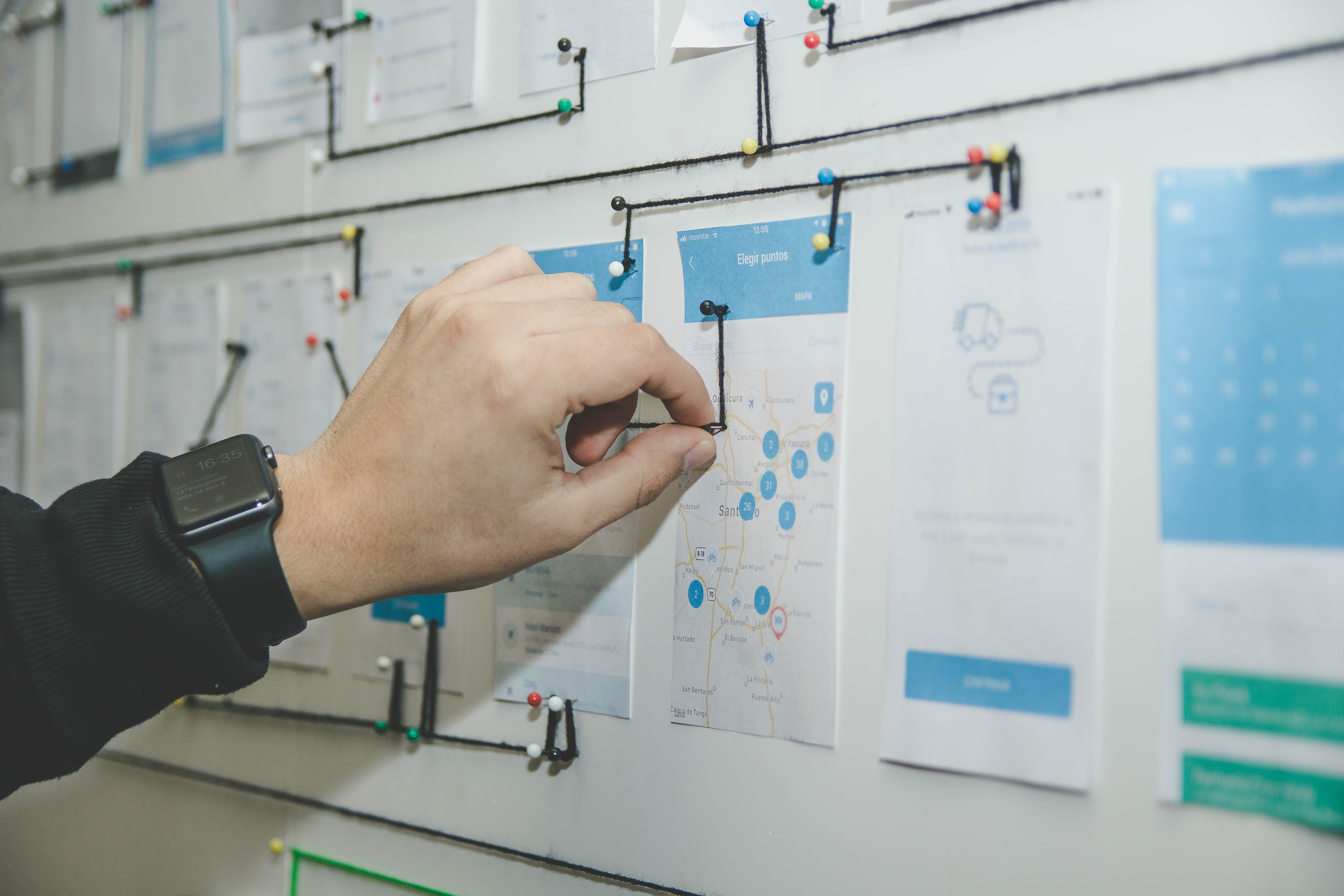
Our team kicked off this part of the redesign by mapping the old user experience flow, meeting with stakeholders to review requirements, and creating a high-level proposal for the new user experience. At this stage, we started bringing developers into our meetings to verify that the high-level flow we’d mapped was indeed feasible to build. We also invited, and received, developer suggestions on the specifics of the design and implementation.
The design and development teams continued to meet weekly, and the design team integrated developer feedback as the vision evolved. As the design neared finalization, we also invited key business and content stakeholders to these meetings to raise any questions, suggestions, or concerns.
The final approved design documents included:
- Stated approval from all parties: designers, developers, and key business and content stakeholders
- User experience flows, showing how a user will navigate the app
- Flows and wireframes for “null state” situations and other rare edge cases
When the final design was approved, our developers were already fully up to speed and ready to start work on implementation. During the implementation phase, designers joined meetings to advise the development team, and we held regular demos to keep everyone in sync, clarify finer points with designers and stakeholders, and celebrate progress together.
We also continued our design cycle protocol during the implementation phase, including:
- Reviewing and discussing design decisions made during implementation
- Updating all design docs with revisions, and reviewing docs internally
- Advising the client of changes, and confirming their approval
- Sharing each set of revised design docs with the implementation and QA teams
Finally, we made sure that the design team was involved in QA. When the app was code complete and testing began in earnest, we asked our designers to walk through the flows and point out minor errors and inconsistencies in the styles and user experience — and designers did indeed catch multiple “design bugs” that might otherwise have confused or misled users when the app launched.
The results
In this case — as in many others I’ve seen — early and frequent collaboration between design and development produced great results. The app release went very smoothly, with minimal post-release fixes. Additionally, our design team was able to immediately hand off complete, updated design assets to Premise’s in-house designer. Even if your current process feels smooth, I highly recommend getting your design and development teams in the same room as early as possible — chances are good you’ll be rewarded with faster builds, fewer post-launch fixes, and better collaboration all around.
