What to expect from product and visual design in 2020

Happy New Year from the Grio design team!
As we kick off 2020, we’re hearing a lot about new and recurring design trends that are likely to dominate the next 12 months. I’ve put together an overview of key things to look out for, focusing on the areas that are most relevant to our work at Grio — namely, technology product design and visual design for web and software interfaces.
Product trends: Product design, interaction design, and user experience
Trend #1: Voice-enabled interfaces
Voice-enabled interfaces have been around for a while now, but they’re becoming much more prominent and popular. That trend will continue in 2020 as users seek increasingly effortless ways of engaging with software and triggering services.
In particular, we’re likely to see ongoing advancement in integrating voice commands with artificial intelligence. We’re also beginning to see more personality in voice-assisted AI; where Apple’s Siri is notoriously robotic, for example, Microsoft’s newer Cortana AI can change tone and tweak its language to match the user’s, and Amazon’s Alexa is starting to move in a similar direction.
Trend #2: AI and chatbots
Artificial intelligence is already widely used in mobile internet and smart assistants, and we will see even more applications in 2020. One key development will be increasingly sophisticated AI in chatbots — voice or text-based applications that either handle customer service requests, or act as an additional online sales channel for businesses (Domino’s interactive pizza bot is a great example).
Trend #3: Animation
We’re likely to see increasing use of animation, motion graphics, and motion effects in interface and experience design this year. Moving elements make interfaces more interesting, and allow designers to draw attention to features and content; they can also help users feel more grounded in an interface, by creating a sense of consistent directional movement akin to real-world gravity.
Trend #4: Designing for speed
Mobile speeds have been improving steadily for years, and as a result, user tolerance for long loading times is plummeting. Latency is now seen (justifiably, in many cases) not as the result not of a poor connection, but as evidence of poor design — so designers will need to pay more and more attention to creating interfaces that load and update fast.
Trend #5: Data visualization
Although there are still plenty of people who love looking at a good spreadsheet, most of us now recognize that a well-designed visualization can make data infinitely easier to digest. We’ll see more designers experimenting with dynamic visualizations in 2020, and we’ll likely also see progress on the technical challenges that are inherent in accessing, cleaning, and depicting complex information.
Trend #6: Device synchronization
Today’s users have access to a multitude of digital devices — from smartphones, tablets and laptops to smart speakers, car stereos, and televisions — consumers are now expecting a seamless experience as they switch between them. That means that designers need to take device switching into account when creating new multi-device platforms and apps. Netflix is one example of device synchronization done well; users can start a movie or show on their phone, continue it on a laptop, and wrap it up on a smart TV without ever having to fast forward or rewind.
Trend #7: UX audits
In accounting, the purpose of an independent audit is to ensure that statements comply with certain legal expectations and financial principles. A UX audit is a similar exercise that examines the performance of a digital interface against up-to-date standards, trends, and technologies.
For companies whose revenue depends on online interactions, an annual UX audit is becoming an indispensable part of doing business. Audits can catch and correct design and technical issues that might be preventing users from completing critical steps (e.g., creating an account or entering credit card information), and they can also be used to maintain design standards and competitive differentiation. Some design agencies charge upwards of $75,000 for a full UX audit, which tells you just how valuable these reviews can be.
Visual trends
Trend #1: Isometric illustration and overlapping effect
When the first iPhone was released in the mid-2000s, it featured a very tactile, three-dimensional illustration style. That style persisted across many interfaces until Google launched their Material Design Framework, which pivoted heavily toward bright primary colors and flat geometric shapes.
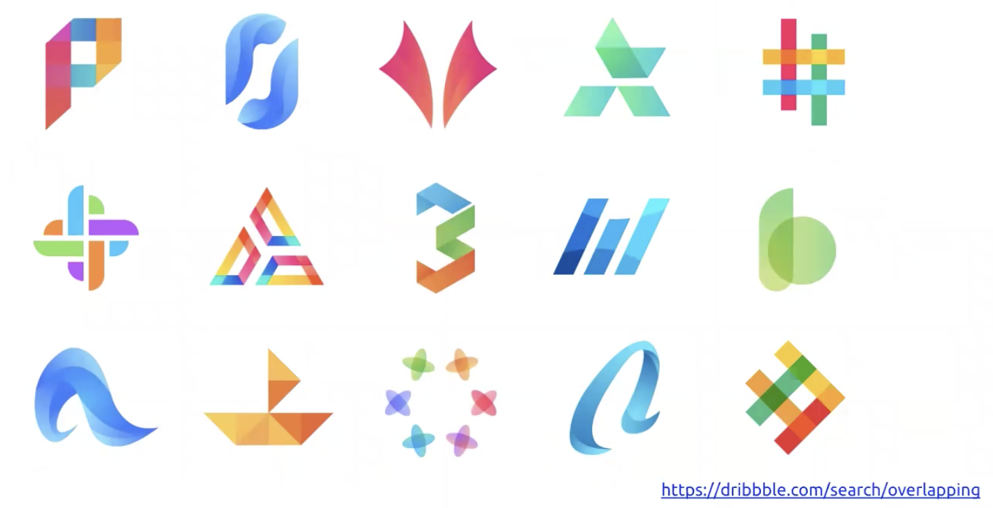
Now, we’re starting to see the re-introduction of depth into design — not to the same extent as in the 2007 iPhone interface, but light drop shadows and dimensionality are making a comeback. One example of this trend is “overlapping effect” designs, which show objects and shadows in a more dramatic, three-dimensional way, while still keeping a flatter visual feel.
 Examples of overlapping effect
Trend #2: Typography
Typography is a perennial design trend that will be especially relevant in 2020. Custom and consciously-chosen typefaces are a great way to communicate characteristics and ideas, and typography is also beginning to figure into SEO — Google has said that it will begin penalizing SEO scores for websites and apps that do not incorporate responsive typography.
Trend #3: Compelling storytelling
Whether it’s UI or UX, today’s business environment requires us to tell a compelling story around the digital experience. In fact, storytelling has become so important that it affects behavior and the overall user journey through an app; no user experience is complete without a cohesive story and relevant, compelling content, and designers need to link that story back to every interaction.
