Applying Composition to the Digital Web Experience
Good composition occurs when every visual element of a photograph has been placed with intent and plays a precise role that adds to the overall story the photo is conveying. By maintaining a balance of detail and space within a frame, the photographer can create pleasing visual aesthetics while communicating a message.
While some photographers have a natural instinct for good composition, others aren’t so lucky. To help others understand these nuanced elements, photographers have simplified certain compositional structures that are known to work into mathematical elements. These elements are then applied to basic grids that can be taught and reused by any and all photographers, old and new.
But can this rule be used in other forms of media? Say, in digital web experiences?
Composition Types
There are five compositional structures that are commonly used by photographers that lend themselves to digital media:
1. Rule of Thirds

The rule of thirds is the most commonly used compositional grid. By splitting the frame into thirds, a photographer can give proper weight to each element. The general goal for the rule of thirds is to place visual elements on a dividing line, or even better, on an intersection point.
2. Golden Ratio

The golden ratio is likely the compositional type you’re most familiar with. It’s a mathematical breakdown of an event of beauty that occurs everywhere in nature. Also known as the golden proportion, golden number, or divine proportion, it can be broken down as proportional growth by the number 1.618.
3. Diagonal

The diagonal composition is a more interesting usage of symmetry within a frame that utilizes angles. Here, a photographer can create a sense of movement or action by disrupting the commonly expected grid pattern.
4. Pyramid

By using diagonal angles converging on a point, a photographer can create leading lines to guide viewers’ attention to a specific focal point within the frame.
5. Z – Pattern

The Z-pattern, also known as the inverted S-curve, is most commonly used in landscape photography. A photographer uses a curve in a river or a windy road to guide the viewers’ eyes around the image.
Photography Composition Usage in Digital Layouts
While the five compositional structures are known goldmines in photography, an examination of three big-name websites reveals their applicability to digital media:
Example 1: Apple.com
Let’s look at Apple’s homepage appearance:

Though many people may not understand why Apple’s designs are so compelling, they are nonetheless visually mesmerizing. Well, to the trained eye, it quickly becomes apparent that much of Apple’s design success is thanks to good composition. An examination of the Apple homepage reveals several examples of the five composition types discussed above:
Rule of Thirds

The Rule of Thirds is typically the most common use case due to the fact that the layout of digital media already works on grids. Grids are used to maintain a visual language throughout a website, as well as maintain a calculated structure throughout multiple breakpoint sizes. As you can see here, the text of the image is strategically placed within one quadrant, while the images are centered around the bottom line.
Pyramid

This image is a great example of the Pyramid composition. The angles of the left and right sides of the watch intentfully drive the users’ eyes up toward the key messaging.
Diagonal

In this example, you can see the diagonal composition literally playing out, not only in the angle of the card, but also with the asymmetric divide between the image and messaging.
Golden Ratio

The elements within this composition are placed intentionally within the Golden Ratio arc to create a pleasing narrative for the user as they can the image.
Example 2: Store.Google.com
For this example, we will analyze the Google Store website:

This website is another great example of composition elements being successfully utilized in digital media:
Z – Pattern

In this example, the advertisement follows the z-pattern to strategically place elements in the order they are intended to be scanned:
- Navigation Menu: The intentional placement along with the brand logo lets users know where they are.
- Product Hero Image: Gets users excited about the product.
- Call to Action: Allows users to quickly understand how to purchase a product.
Composition in All Messages

Compositional layout is key in all messaging, large or small. In this example, we see mindful composition utilized even in individual product tiles.
Rule of Thirds

This example is a very common use case for the Rule of Thirds grid: the image is to one side and the messaging is to the other. What you’ll notice even more is that the main image, the main headline, and the call to action are all placed on intersecting points of the grid.
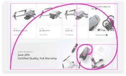
Example 3: Store.DJI.com
Let’s review the DJI store website:

Golden Ratio

The top of the website immediately jumps into the Golden Ratio. Here, we can clearly see it play out as the elements of photography and the digital space are combined. The user’s attention is taken on a pleasing journey of flow from messaging to products to the subjects within the photograph.

The Golden Ratio can even be used when combining multiple digital components together. In this example, the placement of the product images within each individual card component works together to help guide the users’ eyes on a pleasing journey across two different messaging modules.
Rule of Thirds

Because the Rule of Thirds is derived from photographic composition, maintaining this idea requires digital elements to be added as if they are part of the photograph. In this instance, we see the product messaging and call to action placed accordingly on the rule of thirds grid.
Conclusion
Can photographic composition be used in digital web experiences? Yes.
Every time we look at something, whether on our phones, our computers, or in a photograph, all of the same rules apply: every visual element is placed with intent and plays a precise role that adds to the story. Whether that story is an explanation of a product or service, or it’s an announcement of a mission statement, large or small, every message contains a story that needs to be told. If a picture truly is “worth a thousand words,” then utilizing composition provides the ultimate backbone for those words to become a story.