An Insight into Daikin HERO Cloud
In a world of smartphones connected to smart lights, garage doors, alarm systems, and doorbells, it feels as if we can bring smart connectivity to practically anything. Yet it isn’t as simple as having the idea for new technology.
Once you have the system, you then have to find the best way to give the information to your clients. Too little information and they find themselves frustrated by the lack of personalization. Too much information and they feel overwhelmed by data.
Daikin found itself in this very predicament when it created its smart centralized air system. Luckily, Grio was there to help, and I was able to spend the last two years working with Daikin to create the Daikin HERO Simple Edge and mobile app.
An Overview of The Daikin HERO
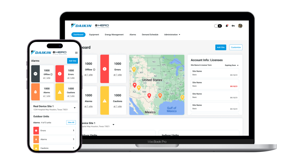
The Daikin HERO Cloud is a responsive application that was created to visualize data from indoor units (IDUs) and outdoor units (ODUs), and remotely troubleshoot errors and alarms. The main features of the app include:
- Multi-site remote monitoring
- Live equipment data visualization
- ODU and IDU refrigerant flow animation, trending, and live data
- Alarm notifications for troubleshooting
- Controlled access
- Protective maintenance
The app works in tandem with Daikin HERO Simple Edge, the hardware device attached to rooftop units (RTUs). Simple Edge captures the data from the RTUs and sends it to the HERO Cloud via a cellular signal.
The Simple Edge and mobile app will not only give service technicians and building owners more transparency into their energy consumption and site data; it will also save time and money by allowing service technicians to remotely diagnose and troubleshoot issues.
Creating the HERO
The HERO Cloud app began as an alpha version with basic information and large images of every unit. From there, we followed the Design Thinking process to continue ideating, revising, and testing. In fact, we are still iterating a year and a half later.
We started the Design Thinking process with a lot of user testing with service technicians and sales representatives. We conducted in-depth interviews to gather information regarding their motivations, highest priority tasks, and challenges with the current alpha user interface (UI).
After gaining insight into the challenges of the alpha model and possible solutions, we started wireframing and iterating. We had frequent design reviews with our client team to ask questions and further understand the processes and product.
As we continued through the Design Thinking process, we made several key improvements based on user testing feedback.
The Dashboard
The Dashboard in alpha didn’t have all of the quick-access information that users needed. It also didn’t fully reveal the status and information at individual sites for technicians to troubleshoot if there was an issue.
To solve these problems, we divided the dashboard into two parts: One part keeps a global view of all sites, and one provides a site-specific view. This allowed users to have a global status view of all of their sites while also being able to drill down into specific site information on the same page. The dashboard follows a simple hierarchy with priority alarms first, license expiration warnings, dates, and data second, and specific site data and operation modes last.
The Equipment Detail Page
We also dedicated a lot of time and research to the Equipment Detail page. The alpha version was confusing and appeared incomplete even though this is the “meat” of the application. It forced users to navigate away from the equipment to troubleshoot because there was no easy flow or links between the pages. We also added scannable top-level values above the piping diagram, along with even more helpful information and settings in the left side panel.
To improve the Equipment Detail page, we focused on adding:
- Data points
- Links to the highest-priority alarm
- Components with corresponding symbols
- Links to indoor units
- Animated piping diagrams
- Live and trending data for each unit
All piping diagrams were improved visually to have larger pipes, components, labels, and a coordinating sensor panel with symbols and meanings. Once these updates were complete, the page became much more powerful and easier to use.
Final Thoughts
From a designer’s perspective, this has been my most fulfilling project at Grio because I’ve been able to take advantage of the design process and give proper weight to each step. For the HERO Cloud app, we have completed four rounds of user testing, each of which has made the product better and better.
For more information on how Grio can help you design custom applications for your products, check out our Grio Projects page or contact us.