An Insight into Daikin HERO Cloud

by

In a world of smartphones connected to smart lights, garage doors, alarm systems, and doorbells, it feels as if we can bring smart connectivity to practically anything. Yet it isn’t as simple as having the idea for new technology. 

Touchless UI – Solving Problems or Creating Them?

by

On my way through the San Francisco International Airport last month, I stopped at one of the new automatic water dispensers to fill my water bottle. I set my bottle down below the spigot and waited for the water to come out, as is common with most of the automatic dispensers currently on the market. However, when nothing happened, I began waving my hand around the machine in an attempt to find the sensor, while simultaneously looking around to see if anyone noticed how silly I looked. 

Designing for Accessibility

by

As I have helped some of my older relatives use technology and have watched them get frustrated time and time again, I’ve realized that tech has continually ignored the senior citizen population. Most of the time when we are designing something, our clients are focusing on the up-and-coming iPhone and the tech-savvy generations.  Even when efforts are put in to create a user-centered design, a consideration of the needs of seniors are not typically part of that process.

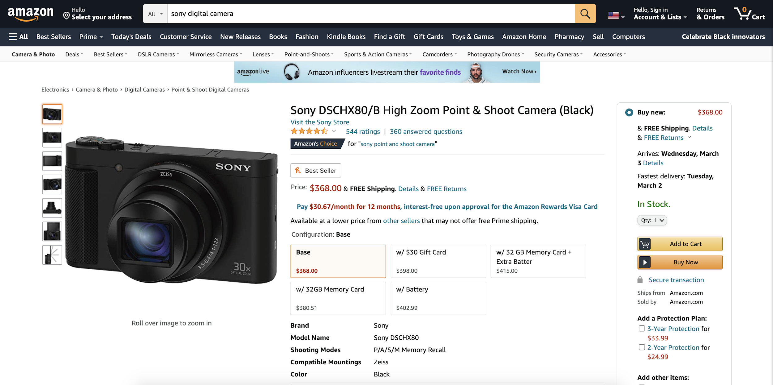
For this post, I’ll review a recent theoretical case study I did for the Amazon.com shopping experience, and review some of the ways that it could be optimized for the senior citizen population. 

Redesigning Grio’s Resource Allocation System

by

As a company that provides an array of different services for clients, one of the things that we’ve always had to do is manage which employees are assigned to which projects.  This includes making sure that their skill sets line up with the project requirements, knowing when team members will be available to move to a new project, and making sure that no one is either over or under utilized.  This process is called “resource allocation.” 

5 psychology principles for designers

by

As a designer, I’ve thought a lot about what makes a product “user friendly.” I know that certain combinations of color, typography, layout, and interaction feel more relevant and intuitive than others — but why? What are the underlying factors that make one interface meaningful and easy to navigate, while another is opaque and confusing?