Motion & UX Design

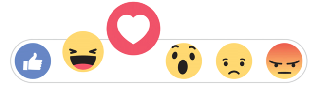
In recent years I have noticed mobile and web apps starting to include motion design in their user experiences. One example of this is Facebook reactions. Instead of the reactions instantly appearing on hover, they gradually appear to the user’s eye and animate to help the user further understand and choose their reaction. If the user hovers over a certain reaction it becomes larger to help signify to the user that that reaction will be the one they choose if the click or tap on it. The motion being used here keeps the user engaged in the app and is included in a meaningful and playful way.
