Motion & UX Design
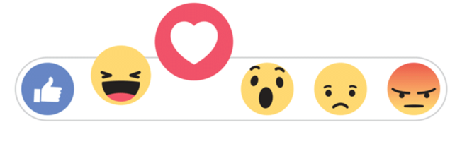
In recent years I have noticed mobile and web apps starting to include motion design in their user experiences. One example of this is Facebook reactions. Instead of the reactions instantly appearing on hover, they gradually appear to the user’s eye and animate to help the user further understand and choose their reaction. If the user hovers over a certain reaction it becomes larger to help signify to the user that that reaction will be the one they choose if the click or tap on it. The motion being used here keeps the user engaged in the app and is included in a meaningful and playful way.
Our everyday life includes everything in motion so it’s not really a surprise that motion design is starting to become widely used throughout mobile and web experiences. I found myself researching combining UX and motion design in order to gain a better understanding on how to marry the two. In this blog post I’d like to share my findings by explaining what motion design is, meaningful motion vs delightful motion, when to use motion in your designs, and what are the best tools to prototype motion design with.
What is Motion Design?
In short, motion design is design in movement. It’s motion that is added to a user experience to help guide the user to complete their task. However, sometimes the motion added to experiences is only added to delight users and is not very meaningful. While this can be visually appealing it can distract users from completing their task. While it is nice to make motion design eye-pleasing the main benefit of adding motion to the UX of your app should always be to help guide the user to complete their task.
Meaningful Motion vs Delightful Motion
Google’s Material Design has great documentation of meaningful and delightful motion. Below is an example from Material Design of meaningful motion:

© Google Material Design
In the motion above it appears as if the card is opening up after it has been tapped on and it also closes in the same manner.
Below is the same UI design but using motion that was not thought out as nicely. Instead of the card appearing as if it is opening, it feels like the cards contents is flying in from several different directions, making it hard to understand how all the content is related and does not help guide the user to navigate throughout the app. While it is delightful, it’s not very meaningful.

These are just a couple of examples from Google’s Material Design documents. I highly recommend checking out their site because it is a great resource not just regarding motion design but probably the most thoroughly researched and documented design system.
When should you use motion in your design?
An understanding of meaningful motion and delightful motion can set you up for success when you do want to add motion to the user experience of your app. You might want to consider using motion to help the user experience of your app if you hear the following feedback from your users:
- “I don’t know where to focus.” – Motion design can help guide your users where to focus. This type of motion design is often added when a user is using an app for the first time and might be unsure of how to use the app. Motion design is added to help guide the user and after the user has used the app enough times the guided motion directions tend to disappear.
- “What’s most important here.” – Sometimes color and text alone isn’t enough to catch the users eye and adding motion design can help again guide the user’s eye to what is important to focus on.
- “I have no desire to use this tool.” – Adding motion to an app can help make your app more engaging and more likely for users to want to interact with it.
- “How do I know I have completed my task?” – Including an animation with completion help attracts attention to the users eye and can help inform them if they have completed their task or not.
- “I don’t understand what this data is telling me.” – Data visualization can be tricky to design and decipher. I’ve started to notice many data visualization graphs animate when loading data in order to help the user understand how to decipher the data.
Prototyping Motion Design
Now that you understand meaningful motion vs delightful motion and when you might want to include it in your user experience, you might be wondering how can you explore adding motion to your designs? Luckily, in recent years there are many more prototyping tools for motion design being created to help designers easily put together prototypes.
Once the only real useful tool to use was Adobe After Effects. Adobe After Effects is a great tool but it’s usually used for a wide variety of things and is too robust for when just trying to prototype motion designs for UX/UI designs. While you can certainly still use Adobe After Effects, there are now tools more focused specifically on motion designs for UX/UI design.
Below are some motion design prototyping tools specifically made for UX/UI designers:
Some designers also like to use Apple’s Keynote animations to help create prototypes too. Just start trying some out and see which works best for you and your project.
Takeaways
Hopefully you now have a better understanding of what motion design is and what is it not. Remember that motion design should always be meaningful and help guide your users and not just a delightful visual experience. Listen to your user feedback and see if adding motion design to your UX can help solve users feedback and don’t just add it to be trendy.