Become a Figma Ninja: Introducing Figma Shortcuts

by

Several weeks ago, I stumbled upon a presentation entitled “Become a Figma Ninja.” While the presentation did nothing to improve my martial arts skills, it did provide incredibly beneficial keyboard shortcuts to improve your Figma efficiency. So, if you are interested in upping your Figma game, this post is for you.  

The Design of You: Maximizing Your Inner Tech

by

When I ask my Grio teammates, “where do you live,” they all give slightly different answers. Some will say “San Francisco” while others say “the Bay Area.” Some say “the United States” while others say “Mexico.” While our answers may all be different, we do have one thing in common: There is only one place we will each live for the rest of our lives. That place is our bodies. 

In this blog, I’ll discuss how our modern lifestyles impact our “inner tech” and look at some of the physical and ergonomic solutions we have to keep our bodies in tip-top shape. 

UX/UI Design Across Cultures- USA & Japan

by

As I discussed in my post Designing Cross-Cultural User Experiences, designers must consider a myriad of points when creating a product that is both accessible and enjoyable for people of multiple countries and cultures around the world. Because different people experience the world through different cultural lenses, it is important to consider how the design of an application is interpreted in different places.

Atomic design: When a Button is a Molecule

by

If you’ve worked on a web design or development project, you can probably appreciate the benefits of reusing design elements across multiple website pages or app screens. Whether it’s a big, obvious chunk — a head or footer, say — or something much smaller, like an image or an icon, a design approach that allows for mixing and matching building blocks can save you a ton of time over one that’s constantly reinventing the wheel.

Motion & UX Design

by

In recent years I have noticed mobile and web apps starting to include motion design in their user experiences. One example of this is Facebook reactions. Instead of the reactions instantly appearing on hover, they gradually appear to the user’s eye and animate to help the user further understand and choose their reaction. If the user hovers over a certain reaction it becomes larger to help signify to the user that that reaction will be the one they choose if the click or tap on it. The motion being used here keeps the user engaged in the app and is included in a meaningful and playful way.

What Is a Design System and When to Create One

by

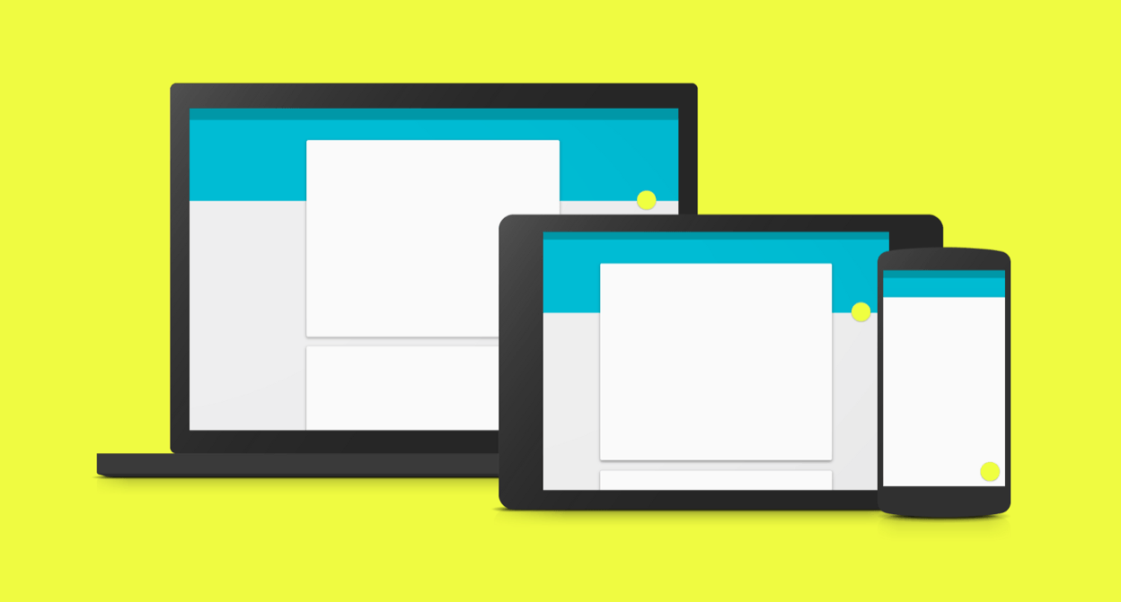
Throughout my continuing journey as a designer I have started to notice several companies are creating what they call design systems. Some people also like to refer to them as design languages, visual languages, or human interface guidelines. Google has Material Design, Apple has created their Human Interface Guidelines, last year Salesforce put together their Lightning Design System, and Airbnb has recently put together a visual design language for their design team. I became curious as what a design system is and why these companies have started to create and document them. Below I’ve broken down my research into a few sections: what is a design system, what are the benefits, and when it is and isn’t beneficial to create one.

Designing Cross-Cultural User Experiences

by

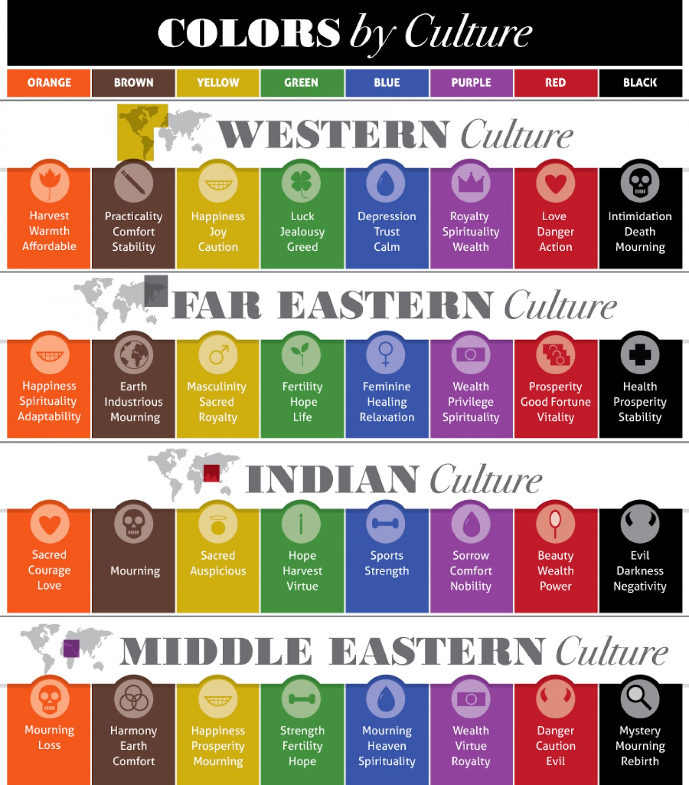
Upon hearing the term cross-cultural UX design most people might be unsure what it means and find it a mouthful to say. As the name suggests, cross-cultural UX design is when designers create a product that can be an enjoyable user experience for all people of all countries and cultures throughout the world. It makes sense that this is a relatively unknown and new term as it has only been used in recent years as our world experiences rapid globalization. Below I put together 6 major points to take into consideration when designing cross-cultural user experiences.