Design Begins With Concept
Creating Something Out Of Nothing
The task of creating something out of nothing is perhaps the most challenging aspect of a designer’s job. Beginning a new project can elicit apprehension about how to proceed and feel intimidating. It is comparable to a writer sitting at their desk, staring at a blank page, waiting for that inspirational first word or sentence to come forth.
To say a designer creates something out of nothing is not always the case. Sometimes a designer works with a client who points them in a certain direction, but their ideas can be vague and uncertain. More likely a client understands there is a problem, but doesn’t know how to solve it, or wants to provide a service, but doesn’t know how to present it and make it easy to use. This is why design is important. Good design solves these types of problems in the simplest and most elegant way possible.
But how do designers begin a project? How do they piece together abstract ideas, words, images, format and context into a final design? Regardless if the project is an app, web site, magazine spread or poster, a plan is needed to integrate design elements, client goals, and user experience into a cohesive whole. This plan is called a concept and serves as a way to unify the design in order to solve problems and effectively communicate to a target audience.
Concepts Begin With Ideas
One of the first phases of the design process is to generate ideas and what are ideas but thoughts in transit to paraphrase the philosopher Pythagoras. Ideas are often abstract or vague, but have the potential to develop into meaningful concepts. During this initial phase it’s good practice to be open to all ideas, even if they seem foolish or silly because sometimes even a bad idea can have some quality about it that can be improved or combined with another idea. It’s not constructive to say to another designer or collaborator (especially during brainstorming) that It’s a bad idea or I don’t like it. Good or bad, strong or weak, silly or serious, consider all ideas that way everyone involved will feel comfortable sharing anything that occurs to them. In other words, it’s a time in the process to not be super critical but open to all possibilities.
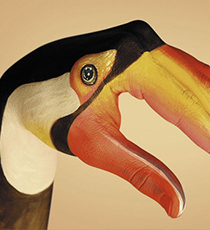
I imagine the audacity of Joe Lawson of The Martin Agency who created the successful Geico Caveman concept: “Here’s an idea … there’s a cavemen living in a modern setting and it’s so easy to use Geico’s website that even he can do it”. I imagine a room full of people scoffing at Joe’s idea, but no one should. It’s this audacity that is encouraged in this first phase of any project. In this particular example, Geico’s Caveman ads were extremely successful because they were humorous, memorable, and helped differentiate them from competitors.

Still image from one of a series of Geico Caveman Commercials
Ideas Begin With Research
One way to generate ideas is to research the project’s subject. For example, if I’m designing a new mobile music player app I’ll begin my research by looking at similar apps to get a sense of the competition, learn what standard design patterns there are, and understand how they are different from each other. This research might inform my design in different ways. It might prompt me to design an app similar to others so the user spends less cognitive load figuring out how to use it. It might inform me of the color palette other music apps use and help me choose colors that differentiate it. I might focus on what is missing or doesn’t work well in music apps and design a solution by adding something unique or tweak some feature to make it better. This doesn’t always mean reinventing the wheel, but rather it’s a stage in the process that allows me to discover what currently exists, what the playing field is, and what possibilities there might be.
There are other techniques besides research to generate ideas. Many of these fall under the umbrella of design thinking. These include Mind Mapping, Visual Brain Dumping, Action Verbs, Rhetorical Figures, Brand Matrix, and using a Creative Brief. I won’t get into describing each of these techniques here, but a great resource that covers these and more is the book Graphic Design Thinking: Beyond Brainstorming by Ellen Lupton.
Sketching
One way to work through ideas is to sketch. Again, using the example of designing a music player app, I’ll sketch the UI, but also the UX, meaning that I’ll create a storyboard sketch that illustrates how a user can complete a variety of tasks in different scenarios. This will help me understand the user context and the UI needed to support it. Sketching should be loose and fast to get ideas down quickly and help problem solve. Sketching is not the end goal, but rather a process that helps designers learn through rapid iteration, refine ideas, and document visual and mental models of how the app can work. Sketches can also be used to communicate with other designers and clients before investing a lot of time on high fidelity designs that might end up rejected.
Although I’ve used excellent sketch apps like Sketchbook Pro and Paper I believe it’s important to not sketch digitally, but to use traditional methods of pen and paper because it’s an opportunity to remove myself from a computer and work with my hands. As legendary graphic designer Paul Rand once said:
It is important to use your hands. This is what distinguishes you from a cow or a computer operator.
Research has recently revealed that using our hands satisfies our primal need to make things. This is especially true for creative activities such as painting, drawing, pottery, and knitting, which generally makes practitioners happy and enhances mental health.
The Key To A Good Concept is Contrast
There are two types of contrast in design. The first is formal and relies on design fundamentals such as typography, color, scale, shape, and layout to create contrast. The second type is conceptual and is used to compare or combine ideas and images to spark new meaning. Formal contrast strives to create an experience that requires less cognitive load, while conceptual contrast forces viewers to read between the lines.
A visual technique to create conceptual contrast is montage, which combines images in interesting ways. Montage was highly utilized by various artists and designers throughout the 20th Century. The most famous artist to use it was Marcel Duchamp who did things like draw a mustache on a copy of the Mona Lisa and turned a urinal upside down and titled it “Fountain.” These simple gestures sparked new ways of looking at images and objects, influenced graphic design, and engaged viewers.
A good example of conceptual contrast is the fashion brand Benetton’s bilingual (English and Italian) publication of Colors, a visual magazine that during its first five years (in the early 1990s) was designed by Tibor Kalman who described it as “a cross between National Geographic, Life, and The Face.” Many of its intrepid themes focused on contrasting cultures and people’s physical differences mainly to emphasize that we are all similar in one fundamental way: Our humanity. Contrast was further achieved by taking Benetton’s ambiguous fashion ads and placing them in a real world context. The design critic Steven Heller describes this in his book Design Literacy:
In its often disturbingly vivid coverage of such themes as deadly weapons, street violence, and hate groups, Colors offered a disquieting contrast to the publisher’s own fashion products. Even the way it was printed, on calendered pulp paper, which soaked up ink and muted the color reproductions, went counter to the brightly lit Benetton shops with happy clothes in vibrant colors. Colors was not Benetton’s darker alter ego, but it did serve to ‘contextualize,’ as Kalman defined it, [their] advertising imagery.

Design spread for Colors magazine uses contrast to convey meaning. Design by Tibor Kalman.
Analytical Concepts
Some concepts implore viewers to think, to read between the lines. Some designers argue that it’s not good to force users to think too much as Steve Krug’s book Don’t Make Me Think clearly contends. In certain context analytical concepts are useful as they rely on recognizable design elements to convey information and meaning that uses low cognitive load. Analytical concepts use typography, color, line, form, infographics, as well as structure, pacing, and flow to help users make sense and gather information quickly. This approach is often used for websites and apps because they are typically navigational by nature and less interpretative. It is also used in editorial layouts such as Time magazine which delivers a mix of infographics, color, and typography to convey information in simple ways.

Example using an analytical approach in a layout design for Time magazine
There are exceptions to every rule and I’m thinking of Bjork’s Biophilia app that creates a playful interactive experience by using a constellation-like interface. It’s fun and enjoyable to navigate and discover how the app works. The user is not in a hurry to experience Biophilia so the context was correctly understood by the designers about how much playfulness should be part of the concept. They relied less on analytical techniques and instead used metaphor.

Screenshot of navigation design in Bjork’s Biophilia app.
Metaphorical Concepts
Metaphors, in essence, suggest something is like something else in order to provide more meaning and understanding. Sometimes a metaphorical concept is as simple as making the navigation like a constellation as is the case of the Biophilia app. In that example, the app’s central concept is a metaphor, but other sections of the app use metaphors such as biology and nature in creative and unexpected ways as well.
Metaphorical concepts are more often used in contexts when the viewer has more time to decode meaning. Book covers, posters, commercials, and advertisements use metaphors to a greater extent than can be useful for web sites and apps. Metaphorical concepts prompt us to not only have a reaction, but a returned response and when that happens successful communication is made and often memorable.
Another example of metaphorical concept is World Wildlife Fund’s 2008 campaign Give a Hand To Wildlife, created by the advertising agency Saatchi & Saatchi. The ads combined the campaign’s simple message (Give a Hand To Wildlife) with eye-catching illustrated hands that represent endangered species. The metaphor here is obvious: Hands like animals. The illustration is so clever it prompts the viewer to identify with the message and results in an emotional connection and desire to help.

Example of metaphorical concept used in World Wildlife Fund’s 2008 campaign Give a Hand To Wildlife, created by the advertising agency Saatchi & Saatchi
Meta Concepts
Meta concepts typically fall under the category of design about design. This is often a designer’s “inside joke” and typically communicates to a design audience. It is often self referential and can be a group or organization’s inside joke, design they will only get and not decoded by the outside world. For example, design posters that complain about frustrating client relations or the easter egg that web designers sometimes code in a web site or app that triggers some unexpected and humorous behavior.
Meta concepts also sometimes occur when a campaign’s slogan turns into a work mantra as Apple did with its Think Different ad campaign (more on this in a moment). An organization’s style guide is meta as it establishes a system for designers and content creators to follow. The magazine Colors was meta as it commented on and provided contextual counterpoint to Benetton’s campaign ads. Another meta magazine, Adbusters, uses design to parody corporate propaganda to enlighten readers about various political, environmental and social concerns.
Recent trends suggest that meta concepts encourage (re)design as a way to acknowledge and anticipate future problems. (Re)design is an open ended system that allows collaboration with users. Facebook, Twitter, Goodreads, Behance, Wikipedia, and Medium work this way to some degree, allowing users to create and edit content, to be contributors. There is potential for meta concepts to empower contributors even more by allowing them to be co-designers and more integrated within the design system. Amazon Prime shows signs of this, allowing viewers to watch and vote on pilot shows from original Amazon series. In this way viewers become part of the greenlighting process.
Concepts As Overlap
Sometimes designers use a combination of several concepts. When this occurs the conceptual strategy is called overlap. Designer’s don’t have to rely on one conceptual strategy, but can use elements from different approaches.
Apple’s Think Different campaign in the late 90s is a good example of overlap. They used portraits of creative thinkers such as Albert Einstein, Pablo Picasso, and Amelia Earhart along with a simple brand statement to spark new meaning and allow viewers to connect the dots. The campaign’s conceptual overlap includes the following:
1. It reveals what kind of company Apple is by celebrating people it admires. Apple is like Albert Einstein, etc. (metaphor).
2. It suggest that if we use an Apple computer we too can be creative, don’t have to be like everyone else, and don’t have to follow the rules (analytical).
3. Apple themselves adopted this motto to inspire employees to think different and create innovative products (meta).

Example of Apple’s Think Different campaign
Concepts Are Important
As you can see there are several conceptual approaches that can be used such as contrast, metaphor, analytic, meta, and overlap. Each has its strength and weaknesses depending on the user context and they can sometimes be used in combination. Design concepts are important because they unify design elements such as image, typography, format, ideas, and context so that an audience can understand and relate to the intended communication. The design process begins by doing research to help generate ideas that have the potential to evolve into a design concept. Ideas can be developed by sketching, which is a quick and iterative process that helps solve problems and can be shared with collaborators or clients.
For your next design project attempt to begin the process by considering the conceptual approach. Do research, generate ideas, understand the context of the project in terms of both client goals and user experience and see if you can design something meaningful and memorable.