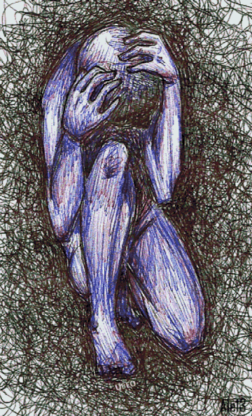
Fear and Empathy in Design

Last Christmas, I had a minor family tech crisis (we’ve all had those, right)? I was visiting my parents, and my mom asked me to AirDrop some photos from my iPhone to hers. I’ve AirDropped photos probably a hundred times, but this time, for some reason, it didn’t work. My phone showed the photos as “sent”, but they weren’t appearing on my mom’s phone.
I could feel my mom’s confidence in my skills plummeting. Before I knew it, she’d snatched the phone out of my hands and barged into my dad’s office. My dad then attempted to troubleshoot the problem — without success — while my mom looked on and grew more and more frustrated. Needless to say, it wasn’t long before my parents were arguing loudly, and everyone in the house was in a terrible mood.

As I watched the unpleasantness unfold, I realized that my parents were both struggling with the same thing — fear, and specifically, fear related to technology. My mom has classic technophobia; she’s reluctant to so much as adjust the settings on her iPhone, for fear she will (actually, literally) blow the phone up. My dad, on the other hand, works in tech and is well-versed in tech-speak — but I suspect that when he was put under pressure to solve my mom’s problem, his imposter syndrome came rushing to the surface. He was afraid of being exposed as a fraud.

A much more peaceful representation of the family dispute
In this particular case, of course, fear just resulted in a big noisy fight. But as I’ve reflected on the incident over the past few months, I’ve recognized that fear is actually a major motivating factor in good design. For example, rideshare apps like Uber and Lyft address the fear of feeling stranded — of not having the autonomy to go from place to place as we please. Dating apps, with their enormous range of options for connecting with the potential “right” partner, arise from our fear of rejection. And apps like Snapchat and Facetune protect our fragile egos by giving us control over how we share images of ourselves with others.
Why is fear so important, and so prevalent, in design? I believe it’s because fear helps us empathize with each other — and real empathy is a requirement for genuine design.
Here’s a personal example: as part of one of my first projects at Grio, I had to conduct a deep dive on a client’s Android app. I’ve been a die-hard Apple user since around 2008, and over the past decade I’ve barely touched an Android device. But I forged ahead, and with some help from my colleagues, soon found myself staring at an Android emulator.
I immediately noticed that the Android interface didn’t make much sense to me. There were buttons I didn’t understand, and interactions that weren’t intuitive. As I struggled to find my way around, it hit me — this is how my mom feels about her iPhone. The whole experience was mysterious and unfamiliar, and I was, in fact, a little afraid that I’d blow something up.
That experience didn’t translate directly to any major design improvements, but it did teach me a lot about how new users feel when they interact with a piece of technology for the first time. And as a UX designer, I believe that’s one of the most important insights I can gain.
I also observed the power of fear as a design motivator during my Master’s program, when I worked on a thesis project related to mental health. My collaborators and I created a concept for a smartphone/smartwatch app that would help people combat depression, and regain control of their thoughts and feelings, by sending them micro-interventions throughout the day. First thing in the morning, for example, the app might remind them of something fun they were looking forward to. Later on, they might get a reminder to appreciate their surroundings, or to take a deep breath before a stressful meeting.
Our motivation for this project was the fear of helplessness. Helplessness is an almost universal human feeling — we all experience it at some point, and everyone working on the app could empathize with our end users’ anxieties. We wanted to help others take small steps toward addressing their fears of helplessness; and, perhaps most importantly, we wanted to let people know that they weren’t alone.
These examples — my rough introduction to Android, and my empathy for others’ struggles with mental health — are just two of many that I’ve found to illustrate the important role of fear in design. As I’ve reflected on these experiences, I’ve come up with a few major takeaways:
- Negative experiences can be an opportunity for innovation. When we experience fear, we can also experience empathy — and, potentially, design a product or service to help others.
- There’s more to everything than meets the eye. On the surface, my parents’ AirDrop fight might have looked like just another minor marital spat. It was only when I stepped back, observed, and reflected on the situation that I was able to see the more complex dynamics and emotions — including fear — at play.
- Empathy is one of our greatest assets — and it can be sharpened and nurtured over time. We don’t all feel immediate empathy in every situation; we develop it by facing different challenges and experiences, and it’s not something we should ever take for granted.
In conclusion…if you’re wondering whether we ever got the photos onto my mom’s iPhone, the answer is no. Eventually, my dad gave up and bought her a new iPhone X. I’m not sure that was the best solution — she’s still afraid of it, along with a host of other issues — but I’ll save those stories for another time.
