Redefining Android UI Development with Jetpack Compose
by

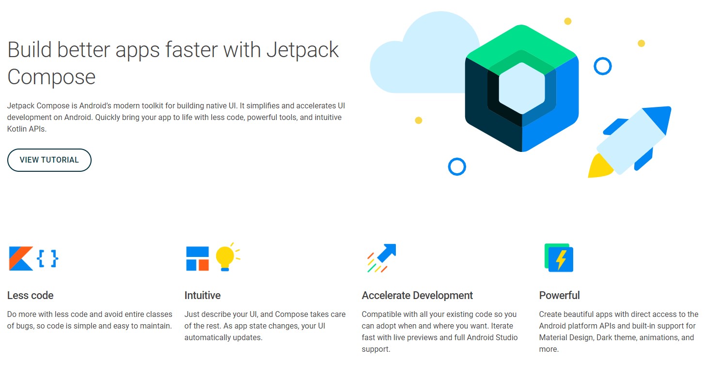
At Google I/O 2019, Google announced that they were working on a new toolkit, Jetpack Compose, which would redesign how user interfaces (UI) are developed on the Android platform. In August 2020, the alpha version of Jetpack Compose was released. In this post, I will be examining how Compose differs from the current Android UI toolkits, and will discuss the benefits that the new program will bring to Android UI development. 

Fear and Empathy in Design

by

Last Christmas, I had a minor family tech crisis (we’ve all had those, right)? I was visiting my parents, and my mom asked me to AirDrop some photos from my iPhone to hers. I’ve AirDropped photos probably a hundred times, but this time, for some reason, it didn’t work. My phone showed the photos as “sent”, but they weren’t appearing on my mom’s phone.

Motion & UX Design

by

In recent years I have noticed mobile and web apps starting to include motion design in their user experiences. One example of this is Facebook reactions. Instead of the reactions instantly appearing on hover, they gradually appear to the user’s eye and animate to help the user further understand and choose their reaction. If the user hovers over a certain reaction it becomes larger to help signify to the user that that reaction will be the one they choose if the click or tap on it. The motion being used here keeps the user engaged in the app and is included in a meaningful and playful way.

What Is a Design System and When to Create One

by

Throughout my continuing journey as a designer I have started to notice several companies are creating what they call design systems. Some people also like to refer to them as design languages, visual languages, or human interface guidelines. Google has Material Design, Apple has created their Human Interface Guidelines, last year Salesforce put together their Lightning Design System, and Airbnb has recently put together a visual design language for their design team. I became curious as what a design system is and why these companies have started to create and document them. Below I’ve broken down my research into a few sections: what is a design system, what are the benefits, and when it is and isn’t beneficial to create one.

What is Pixel Density and Why Should You Care?

by

Pixel density is the number of pixels per linear physical unit. Measured in pixels per inch (ppi or dpi). Pixel density and resolution are technically the same thing, but often people say “resolution” to mean “pixel count,” a related metric:

count = densityH * width * densityV * height

When other things are held constant:

Designing Cross-Cultural User Experiences

by

Upon hearing the term cross-cultural UX design most people might be unsure what it means and find it a mouthful to say. As the name suggests, cross-cultural UX design is when designers create a product that can be an enjoyable user experience for all people of all countries and cultures throughout the world. It makes sense that this is a relatively unknown and new term as it has only been used in recent years as our world experiences rapid globalization. Below I put together 6 major points to take into consideration when designing cross-cultural user experiences.

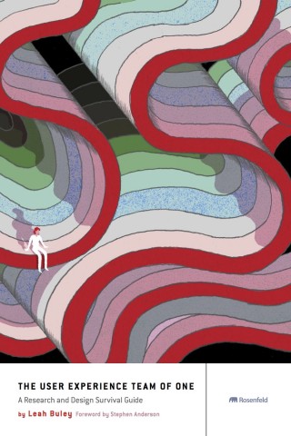
The User Experience Team of One: A Research and Design Survival Guide

by

I’ve recently made it one of my goals to learn more about UX and design.  To that end, I read a book that was highly recommended by our Grio designers, The User Experience Team of One: A Research and Design Survival Guide, by Lean Buley. The book is written for people who are or want to be UX professionals, with a focus on those who either the only person in their company working on UX or who are in some way UX evangelists in their organizations.  Although the intended audience of the book is UX professionals, there were also number of tips and ideas that a company like Grio can find useful.  On many projects, especially when budgets and time are tight, Grio takes on the role of UX evangelist for our clients.

Loading an Image Asynchronously in iOS

by

If you had read thru Apple’s iOS Human Interface Guidelines, I’m sure you’d notice that it mentioned about how your app should provide a responsive user experience. If the app is processing a lengthy operation, it ought to provide a feedback as suggested by Apple, “Subtle animation can give people meaningful feedback..” Consider this lengthy operation:  loading image from a URL. This is a very common task. The problem is, UIImageView doesn’t have a built-in method that lets you load an image and at the same time give you a chance to provide a meaningful UI feedback such as a “subtle animation”.

You Do What Android Want = Android Do What You Want ~ Part 1: The Mystical 9-Patch

by

The Mystical 9 patch

You Do What Android Want = Android Do What You Want
Part 1: The Mystical 9-Patch

I recently encountered some blank stares from some colleagues regarding certain aspects of the 9-patch.

Granted, there doesn’t seem to be all that much documentation out there explaining the ins and outs of nine patch, possibly adding to the mystique, but then again, maybe there isn’t all that much to explain.

Here I’ll outline the basics of the 9-patch, and you can comment as to whether it indeed makes simple sense… or instead, communicate your own blank stare with some scathing criticism below in the comments section.

Testing UI in iOS….and some Gotchas

by

Most times in your application  a solid unit test trumps testing your UI. But that’s no reason to neglect your UI from having to endure the same rigorous testing you give your models. “But I don’t have time to sit around and tap every part of my application.”, you say. Enter Automation…