UX/UI Design Across Cultures- USA & Japan
As I discussed in my post Designing Cross-Cultural User Experiences, designers must consider a myriad of points when creating a product that is both accessible and enjoyable for people of multiple countries and cultures around the world. Because different people experience the world through different cultural lenses, it is important to consider how the design of an application is interpreted in different places.
In this post, I will discuss some of the main elements to consider when designing an application for both western and eastern consumers, and will examine how these elements specifically affect design patterns in the United States and Japan.
Color Symbolism
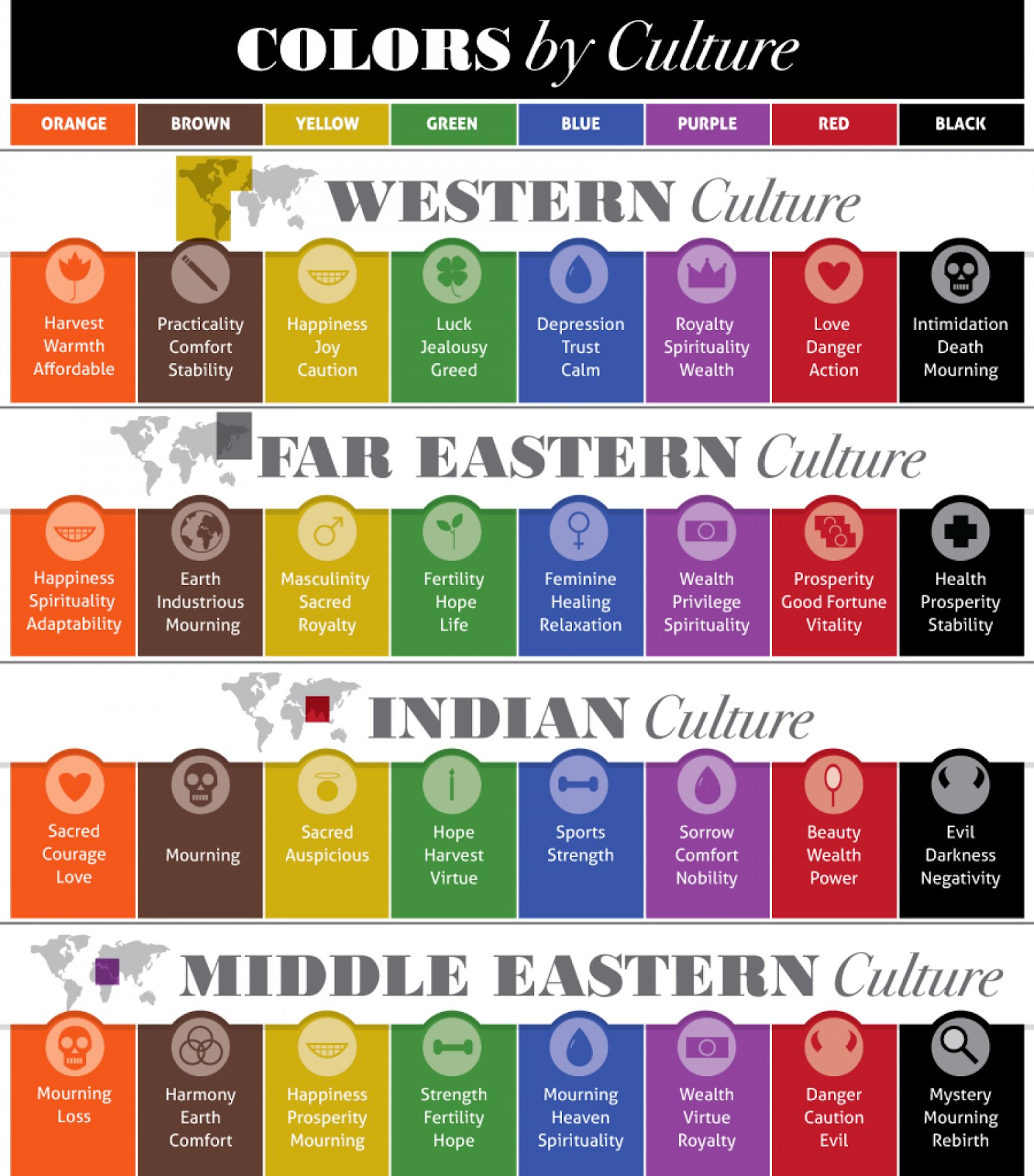
The first thing we think about when designing an application across multiple cultures is the color scheme. While we, in western culture, associate specific colors with specific feelings, those associations can be radically different for other cultures.

For example, as seen in the graphic above, western culture associates the color red with love, danger, and action. However, Southeast Asian countries typically associate the color red with prosperity, good fortune, or vitality. For this reason, designers tend to avoid red in American applications, while they tend to favor red for Japanese applications.
We see this trend clearly in McDonald’s branding. Brand colors for McDonald’s are yellow and red. However, when we look at a screenshot of the American website, we see that the primary color utilized is yellow. In fact, the only red on their website is on the actual products:

On the other hand, the Japanese McDonald’s website takes a much different approach. As seen below, the McDonalds website in Japan uses red generously in both their imagery and text:

In the same way, Rakuten, a Japanese e-commerce site, looked at cross-cultural design when creating an application marketed towards western consumers. While the Japanese site, screen-shotted below, favors a pink color scheme and uses red for almost all of the navigation links and icons, the website created for the American market, as seen below, uses a softer purple to pink gradient for its color scheme:

Both McDonald’s and Rakuten cleverly altered their color schemes to appeal to their target audience.
Country-Specific Design Patterns
The next thing you want to think about is country-specific design patterns. When you look at the websites for a certain country, you begin to notice that most of them will follow similar design trends based on what sites are currently popular. For example, in the United States, we like a lot of full bleed in designs, we like a lot of images, and we prefer to have things straight and to the point. Most of our websites are focused on ease of use and minimal reading. However, in Japan, the website trends are much different.
Let’s look at a screenshot of the American Disney homepage:

Here, we notice that the webpage has two distinct sections. The navigation area, located at the top of the page, is purely straightforward text. If we look further down the page, the remainder of the site contains a lot of images that are aimed at catching your attention.
Now, let’s look at a screenshot of the Japanese Disney homepage:

The first noticeable change is to the navigation bar; whereas the American bar was purely text, the Japanese navigation bar inserts an icon for each navigational element. As you look down the page, there are still a lot of attention-seeking images; however, each image is accompanied by much more text.
These cultural trends are once again apparent when you look at a screenshot of the American Yahoo! news site:

Most news sites in America use a lot of imagery to try to capture the user’s attention and entice them into clicking on the articles. On the Yahoo! site, we once again see a text-based navigation area, followed by lots of photos with short, catchy slogans.
However, if you look at a screenshot of the Yahoo! Japan homepage, it looks like a website that we would have seen in the United States 15 years ago:

Like the Japanese Disney website, the Japanese Yahoo! website uses icons for their navigation elements at the top of the page, while the body of the page is almost entirely text.
While this style may seem unusual or outdated to American users, it is the norm for Japanese websites. For this reason, considering country-specific design patterns is essential for creating a successful application.
Language Compatibility
The next thing you want to keep in mind is language compatibility. Language compatibility becomes especially important for mobile applications where there are tighter space restraints.
When text is translated into another language, the string of text can be expanded or contracted, depending on the language. When you create boundaries for your text on a mobile application, longer strings of text may no longer fit within the boundaries.
Japanese text is typically shorter than English text, meaning that English to Japanese translation does not frequently encounter space issues. However, the special alphabet (katakana) that is used to translate foreign words into Japanese-equivalents is typically longer than English.
These screenshots of the YouTube mobile application are a perfect example of this phenomenon:

As you can see above, the English screenshot has a button titled “Fashion and Beauty.” The equivalent button on the Japanese site says “ファッション…” which translates to “Fashion…” In this instance, YouTube has solved the text length issue by using the ellipses to show that there is more to the title than the space can accommodate.
However, companies are not always entirely successful when it comes to language compatibility. For example, let’s look at the difference between these English and Japanese Spotify screenshots:

In general, Spotify appears to have done a fairly good job accommodating the length of the Japanese text. However, if we look at the “Your Favorite Artists” line on both screenshots, we can see that one letter of the Japanese text carries into the next row.
While dropping text to the next line can work in instances where a full word or phrase is dropped, this instant of dropping a single letter is an example of where Spotify’s solution to text length variations has failed. In dropping the letter, Spotify has made the text harder to read for their users. If Spotify is targeting Japanese consumers, they may want to consider finding a different alternative, such as making the text smaller, to accommodate the translations.
The Small Details
The final thing I want to talk about is being mindful of the small details. In other words, it is important to understand the culture that you are trying to connect with when designing an application. To demonstrate this point, we can examine the final imagery that companies choose for their applications.
Let’s look at a screenshot of the homepages for Subway in American and Japan.

As most of us know, Americans like food. Often on food websites, companies will showcase large quantities and large amounts of food. On the Subway website, we see multiple “footlong” sandwiches up top, as well as a stack of four sandwiches down below.
The Japanese website looks quite different. Subway understood that Japanese consumers would prefer different portions so they targeted the imagery to fit the clientele. On the Japanese website, we see single, small sandwiches with smaller coffees and soft drinks.
This type of cross-cultural design extends in both directions. Line is a messaging application that is extremely popular in Japan. It is known across Japan for its cute animal mascots and sticker collection:

However, when Line wanted to market their product in America, they decided to create stickers that would be more marketable to Americans. They hired artists to create stickers that would appeal to their American clientele, such as the ones you see below:

By considering the cultural preferences of a target audience, designers can use the small details to more successful appeal to consumers.
Conclusion
There are countless elements to consider when designing applications for different cultures and countries. I hope that after reading this post, you can begin to see how manipulating these elements when creating cross-cultural designs can drastically improve the success of a product. When preparing to expand an application to a new country or culture, remember to always consider the four points we discussed:
- Colors – Colors have different connotations in different cultures. Research their meaning to use them to your advantage.
- Country-Specific Design Patterns – Study the design trends and patterns used in the country you are targeting to ensure that your application can compete with similar sites.
- Language Compatibility – Ensure that your designs are able to accommodate the expansion and contraction of text when the language is changed.
- The Small Details – Pay attention to the culture of your consumers to make sure you are presenting them with imagery and details that are familiar to them.