Creating the Website for IBM’s “Urgency of Science” Initiative
Several months ago, in the height of the pandemic, Grio partnered with AKQA, a design and communications agency, to help build a website for IBM’s new initiative called “The Urgency of Science.” In this blog post, I will discuss the project, as well as the React Animation technologies we used to make their designers’ lofty website dreams a reality.
The Urgency Of Science Initiative
AKQA was asked by IBM to create the website for a new initiative called “The Urgency of Science”. The goal is to highlight the many ways in which IBM technologies are being used in science, such as through their cloud services, artificial intelligence (AI), and IBM Watson. IBM believes that many of the mounting challenges facing the world, including the pandemic, economic inequality, food security, and climate change, require innovative solutions that IBM can provide. The goal of the initiative is to tie together IBM science and these problems to find a solution.
Grio and AKQA were asked to build a new website to introduce the initiative. IBM wanted to use the New York Time’s 1619 project website as an inspiration for the new website. Like the 1619 Project website, they wanted the site to be a scrollable, animated, and moving website that provided the viewer with an immersive story-telling experience.
Grio’s Role
AKQA had a solid design for the website and lots of designers, along with a developer and a tech lead. However, they needed assistance figuring out how to turn the designs into reality. Grio was brought in to provide React animation assistance.
Demo/Showcase
To understand everything the website has to offer, you can check it out here:

How the Website was Created
The site was created using a unique tech stack that included:
GSAP
As you scroll through the website, certain sections of the website scroll horizontally, even though the user is still scrolling down with their mouse. These effects were created using the Killer feature: ScrollTrigger plugin.

As you can see in the code above, we animated a section of the website to scroll horizontally across the x-axis. This was completed by inputting the height of the horizontal section and the total number of slides used in the horizontal scroll. The ScrollTrigger plugin used this information to specify which sections of the website would scroll horizontally versus vertically.
Framer-Motion
Framer-Motion was used to create the simpler, React-focused animations on the site. Some examples include:
- “Support the Urgency of Science” Button: Framer-Motion allowed the button to appear and disappear periodically as you scroll.
- Word-by-Word Sentence Reveal Animations: Framer-Motion allowed us to control when each word appeared on the screen to give target sentences a more impactful entrance.
As you can see in the code below, you can use variants (in this example, we have “show” and “hide”) in the React state system to define the variant prompts we want for each animation.

Lottie / After Effects
We used Lottie to play exports out of After Effects. Lottie and After Effects handled anything that we couldn’t animate with GSAP and Framer-Motion.
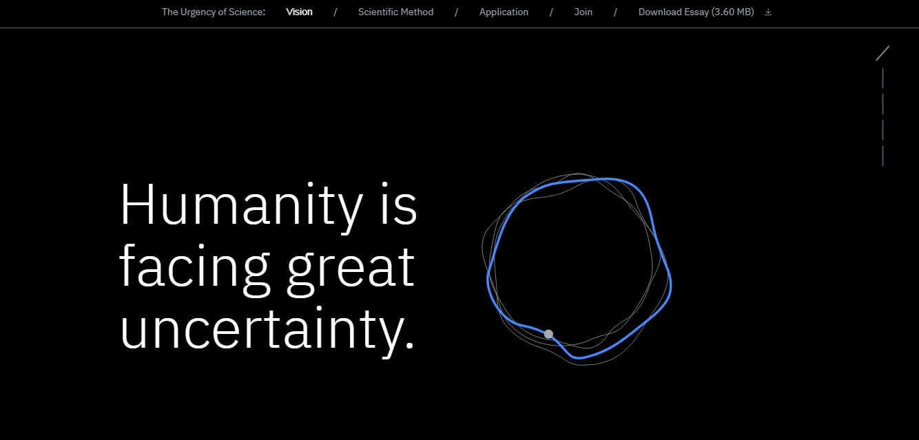
The designers created animations in After Effects that could be played like a video. The animation was then exported to Lottie. For example, in the discussion of the scientific method, the animations of fertilizers falling onto the seeds were created by After Effects and played by Lottie. Lottie was also used to animate the rings at the top of the main screen that contorts and grows as you scroll.

The code above is how we controlled the fertilizer animation. As you can see in the markerIndex, React was used to loop the frame constantly until the user moved to the next slide.
TailwindCSS
With TailwindCSS, you write Tailwind’s utility classes directly into the markup, which means you don’t have to maintain other semantic class names, such as ‘content-wrapper,’ ‘content-header,’ and ‘content-body.’ This saves time because you are able to write in the style directly, rather than referring back to other locations. TailwindCSS also has advantages over inline styles in that you are able to do media queries and target things like hover state.

At the div at the very top of the above code, you can see that we wrote in Tailwind classes and utilities (e.g. flex flex-col lg: flex-row relative px-6 lg, etc.). This is much shorter than a separate CSS file with a media query and writing the CSS yourself.
This is a great way to write a lot of custom CSS and control just what you want. You don’t have to worry about class names clashing with each other, and the whole process seems to be much more efficient.
Going Live
It’s important to be able to understand and utilize the latest front-end frameworks to deliver great, new experiences to users. Being able to draw on the best parts of each of these technologies allowed us to deliver a cutting-edge solution in 6 weeks.It was an exciting challenge to be able to create such an unusual site, that so clearly represents the innovative solutions that IBM is bringing to the world’s biggest challenges and I’m proud to have had the chance to contribute to it!