Designing for Accessibility
As I have helped some of my older relatives use technology and have watched them get frustrated time and time again, I’ve realized that tech has continually ignored the senior citizen population. Most of the time when we are designing something, our clients are focusing on the up-and-coming iPhone and the tech-savvy generations. Even when efforts are put in to create a user-centered design, a consideration of the needs of seniors are not typically part of that process.
For this post, I’ll review a recent theoretical case study I did for the Amazon.com shopping experience, and review some of the ways that it could be optimized for the senior citizen population.
The Assumption:
I began my case study with the assumption that the senior citizen population is a significant part of the Amazon user base. Seniors are a growing population, yet one that is continually ignored by big tech. Most tech companies focus on younger, more tech-savvy users, as they are the ones more likely to purchase and use the new products that are created. However, failing to recognize senior citizens as potential users creates missed opportunities for tech companies and disadvantages for older users.
Research Stage:
In the research stage, I would conduct in-depth interviews and moderated usability tests to further understand the pain points and motivations of the senior population. This would allow us to properly prioritize new features and changes for the shopping experience.
Some of the questions that would be asked in the interviews include:
- What devices are shoppers using? Are they using smartphones, or do they prefer the wider screen and larger touch targets of tablets or even desktop devices?
- Why are they going to Amazon for their shopping needs? Is it because groceries can be easily delivered? Is it because loved ones are registering for gifts online here? Or is it because they have more discretion when purchasing personal items?
- What is the most difficult part of the user base’s shopping experience? Is it trying to find the product because they can’t search and filter properly? Is it the checkout process? Is it the complexity of finding information, such as specs and delivery times on the product detail page?
- How can software programs be more helpful when users do run into errors? When users receive error messages, are they seeing the error message properly, and is the error message helpful?
- What is the software missing visually? Are touch targets large enough? Is there enough contrast between buttons or links? Are there any specific gestures that are harder for the older population? Are the icons ambiguous?
Amazon Critique:
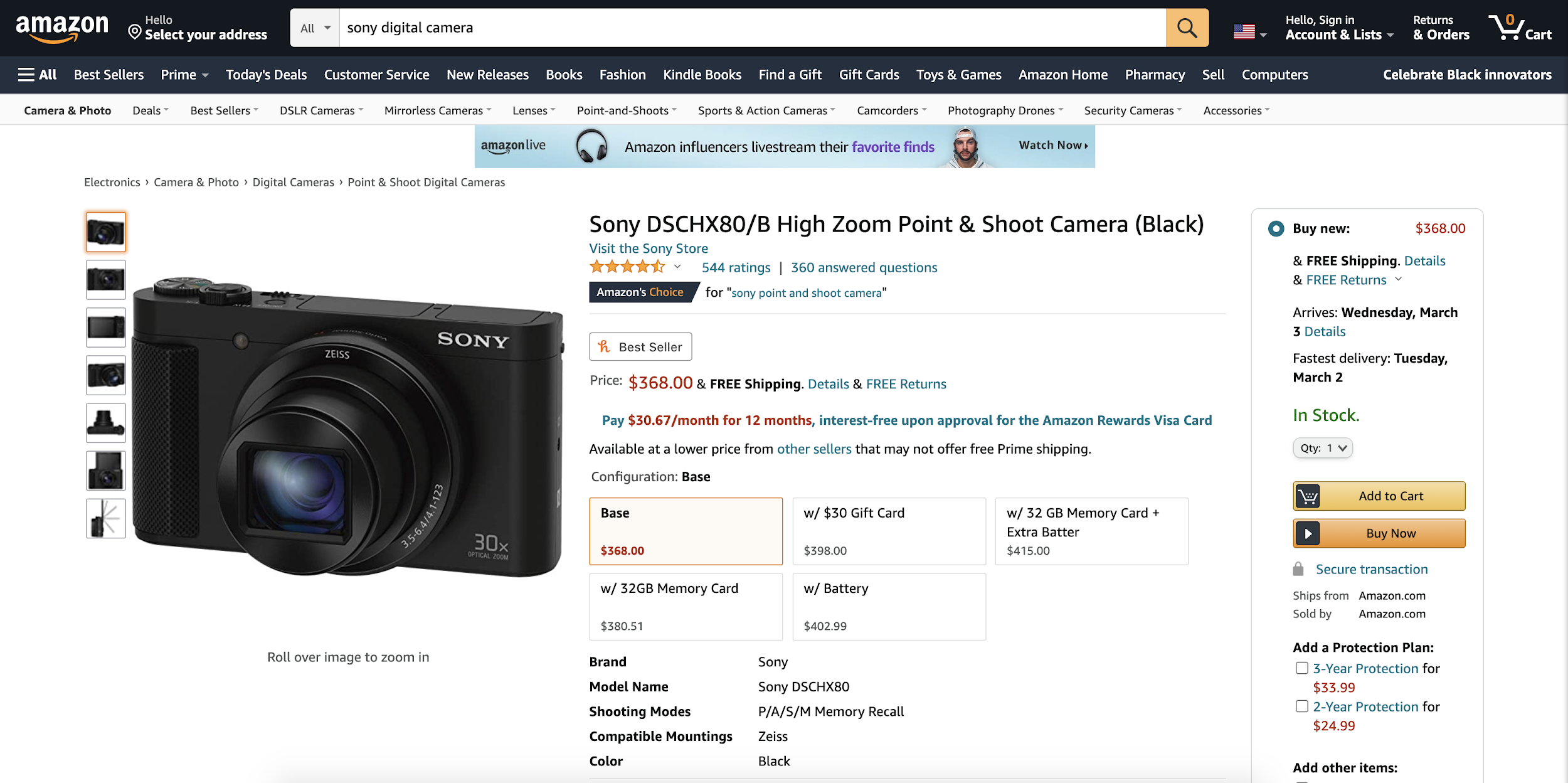
Based on the results of these interviews, the next step is then pinpointing the areas of concern. For example, this is a current Amazon product detail page:

After reviewing this page and using Amazon’s website, I settled on three main critiques:
- Product Pages: The product pages are too long and disorganized. There are also a lot of different button colors and text colors, which can be overwhelming. The pages provide a lot of good information, but there isn’t a clear hierarchy on the page, making it harder to find the information you want. Additionally, the layout of the page can change based on both how you access the product page and the device you are using. This makes it challenging to learn navigation and shortcuts.
- The Top Banner on the Website: Amazon’s top banner is too cluttered. For example, instead of having a simple “sign-in” button when you initially enter Amazon’s website, the header gives you a tooltip to sign in that disappears after a few seconds.
- Error Messages: If you receive an error message, it typically contains information about the error, but not about the solution. This means that users that aren’t tech-savvy are likely receiving the same error messages repeatedly because the website is not helping them understand the issue. It would be more user-friendly to either provide a link to customer support or an action item to address the error.
Hypotheses:
The next step is to come up with hypotheses that would hopefully be validated with new designs. I have drafted three hypotheses based on the results of the earlier steps:
- Seniors are Accident Prone: The senior community tends to make more errors than the younger users either from visual or motor decline. With this comes frustrating error messages that are vague, difficult to read, or don’t provide a solution. We need to offer actionable items to correct the error, as well as contact information if they need additional support.
- Low Accessibility: Because of gradual vision impairment in the senior community, text, icons, and labels must be large enough to be legible. Icons should be paired with text labels, and the contrast between elements should be increased.
- Cognitive Overload: Amazon’s product pages are incredibly overwhelming with paragraphs of texts, low contrast buttons, small touch targets, long pages, and lots of links and buttons. The product pages need to be streamlined, and important text, such as price and purchase buttons, must be prioritized visually and physically.
Design Thinking and Process
Once I made my theoretical hypotheses, I created some low-fidelity wireframes that provide an example of how I would restructure the Amazon product detail page. These examples are fairly simple, and strip out several of Amazon’s unique extra features. While some users may bemoan the loss of these features, streamlining and simplifying the user interface (UI) will appeal to a wider user base.

As you can see in the photo above, my hypotheses were addressed in the following ways:
- Top Banner: I have simplified the number of options on the top banner, and made it far easier to find the “sign-in” button.
- Bottom Banner and Shortcuts: To address the large amount of information on product pages, I created a sticky bottom navigation banner that provides shortcuts to various locations on the page. This way, if the user is looking for something specific, they don’t have to scroll through the entire page to find it.
- Navigation Bar: I personalized the navigation bar at the top of the product page based on what the user typically clicks on to help expedite future navigation.
- Icons and Buttons: Large labels were added to all icons, and the colors of buttons and icons were exaggerated to create greater contrast.
- Price Button: The price button was enlarged and the contrast was increased to ensure that users can easily find it.
Further down on the page, we have the product specification:

As you can see, I once again attempted to simplify the page to make it cleaner and easier to read.
For the reviews section, as seen in the photo below, I allowed users to sort and filter the reviews. I also put the reviews in a laid-out format instead of a dropdown option.

Overall, I feel that this was an interesting and challenging case study since it is a site that my family and I use quite frequently. While I do think Amazon does a good job based on the amount of content they include, there is always room for improvement. As UX designers, we aren’t just responsible for creating apps that we will enjoy; we are also responsible for doing our part to make sure that our products are focused on the people using them. By thinking about senior citizens during the planning phases, we can ensure that we are creating products that can be enjoyed by all.